Preview image. Unlock full-res
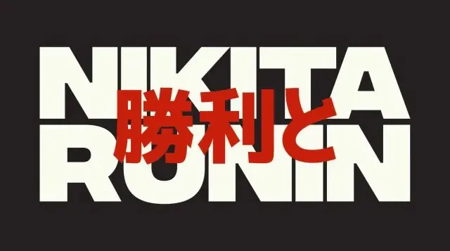
A two-line 'NIKITA RONIN' wordmark in heavy cream sans-serif on near-black, with red Japanese kanji overprinted across the center as a second layer.
Summary
A bold "NIKITA RONIN" logotype stacked on two lines in cream all-caps, with red Japanese kanji overprinted straight across the middle so the two scripts collide as deliberate layers.
Visual description
On a near-black warm-charcoal ground, the word "NIKITA" sits on the top line and "RONIN" directly below, both in a very heavy, near-condensed cream sans-serif with squared, blocky terminals and tight letterspacing that fills the frame edge to edge. Overlaid across the vertical center, partially covering both words, is a row of red Japanese kanji at large scale. The red type sits on top of the cream, so where they intersect the red wins, creating an aggressive double-exposure effect. Only three colors are present: warm black, cream, and a single saturated red.
Key takeaway
Overprinting a second script (here red kanji) directly across an existing wordmark instead of beside it, so the layering itself becomes the identity rather than a clean lockup. The strict three-color limit (black ground, cream type, one red) keeps the collision legible despite the overlap.
Reuse notes
A good move for streetwear, music, gaming, or media brands wanting an energetic, slightly aggressive bilingual mark. The overlap reduces legibility of both layers, so it suits a hero or merch graphic more than small-scale application. Keep to a single accent color or the layering turns muddy.
More like this


Keep what you find
A free account saves references to boards and can send you a weekly email of picks based on what you save.
To see every result, go Pro.