Preview image. Unlock full-res
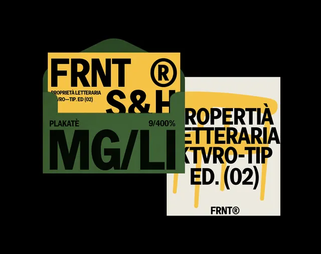
Two overlapping square poster cards for 'FRNT' stack heavy condensed type, a registered mark, and Italian micro-copy in olive green, mustard yellow, and cream on black.
Summary
A pair of overlapping square poster cards branding "FRNT," packing heavy condensed type, a large registered-trademark R, and tiny Italian captions into olive green, mustard yellow, and cream blocks on a black ground.
Visual description
Two square cards sit at slight angles, overlapping near center on a pure black field. The back-left card is olive green: a tall condensed bold "FRNT" with an oversized superscript ® up top, then "S&H", a bracketed micro-caption ("PROPRIETA LETTERARIA / KTVRO-TIP. ED. (02)"), the word "PLAKATE", a small "9/400%", and a cropped mustard "MG/LI" running off the bottom edge. The front-right card is cream and yellow: it carries the same Italian-flavored text, "PROPRIETA LETTERARIA / KTVRO-TIP / ED. (02)", in heavy black caps over a dripping mustard-yellow shape, with a small "FRNT®" footer. The two cards share one type system but flip the palette, so they read as recto and verso of the same poster.
Key takeaway
Building a brand as a small kit of overlapping poster cards that swap foreground and background colors, the same condensed type, captions, and ® reshuffled, gives a system that looks generative and editioned. Cropping the big type off the card edge adds tension and implies the design continues past the frame.
Reuse notes
Good for a type foundry, print studio, record label, or zine identity that wants an industrial, editioned feel. The fake catalog metadata (edition numbers, percentages, bracketed codes) sells the archival/technical mood; lean into it. Caveat: it is intentionally dense, so it suits expressive brand or poster work, not clarity-first product or marketing pages.
More like this

Keep what you find
A free account saves references to boards and can send you a weekly email of picks based on what you save.
To see every result, go Pro.