Preview image. Unlock full-res
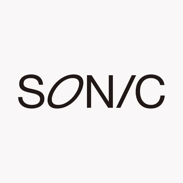
Minimalist wordmark reading 'SONIC' in a geometric, open sans-serif typeface centered on a light background.
Summary
Minimal wordmark for "SONIC" set in a geometric sans-serif typeface with open counter forms, centered on a light off-white ground.
Visual description
The word "SONIC" displayed horizontally and centered in the frame, set in a contemporary sans-serif typeface with consistent stroke weight and notably open apertures in letters like O. The clean letterforms occupy roughly the vertical center of the composition, leaving substantial empty space above and below. The typography appears to be designed with geometric precision, with slight geometric angularity in the letterforms. The background is a neutral, warm off-white or pale grey, allowing the dark letterforms to read with maximum clarity and contrast. No additional graphics, color, or ornament. The overall effect is one of disciplined modernism.
Key takeaway
The power of single-word, centered composition with significant negative space allows the typeface itself to become the complete brand mark. The use of a geometric sans with open counters creates visual interest without ornamentation. The near-monolithic word form reads as confident and direct, appropriate for technology or contemporary service brands.
Reuse notes
Effective for startups, tech companies, or any brand needing a confident, pared-back identity. The legibility at scale and in reduced sizes makes it suitable for apps, favicons, and small-format applications. Best paired with supporting marks or logotypes; on its own, it reads more as a typeface specimen than a fully formed logo system.
More like this





Keep what you find
A free account saves references to boards and can send you a weekly email of picks based on what you save.
To see every result, go Pro.