Preview image. Unlock full-res
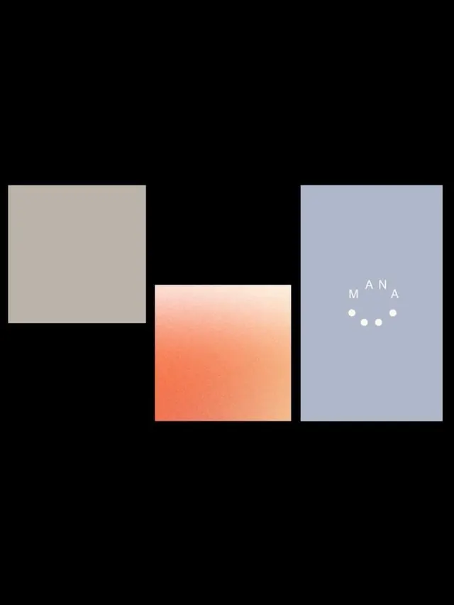
Three overlapping rectangular color blocks with gradient fills and dot motifs, anchoring the wordmark MANA as a modular brand system.
Summary
Three overlapping rectangular color blocks with gradient fills and dot motifs, anchoring the wordmark MANA as a modular brand system.
Visual description
Three rectangular color blocks overlap horizontally against a black background: a warm taupe square on the left, a peach-to-orange gradient square in the center, and a pale blue rectangle on the right. Each block contains subtle gradients, creating depth. The right block displays "MANA" in white text (all-caps, sans-serif) with five small white dots arranged in a scattered pattern beneath it, forming a secondary mark. The overlapping arrangement creates visual tension and movement while maintaining a calm, balanced composition. The gradient fills and soft color palette contrast sharply with the black void.
Key takeaway
The modular color-block approach where each component is independently valuable but harmonizes when overlapped. The gradient fills add dimension while maintaining minimalism. The dot pattern offers a flexible, abstract mark that can adapt to different layouts. The neutral/pastel palette achieves visual softness without saccharine aesthetics.
Reuse notes
Ideal for design studios, agencies, or portfolios needing a modern, modular identity system that adapts across touchpoints. The overlapping blocks work well in horizontal stacking but can be rearranged for flexibility. The calm palette and abstract forms pair well with bold photography or illustration. The dot motif scales easily for secondary applications (business cards, web icons, social media).