Preview image. Unlock full-res
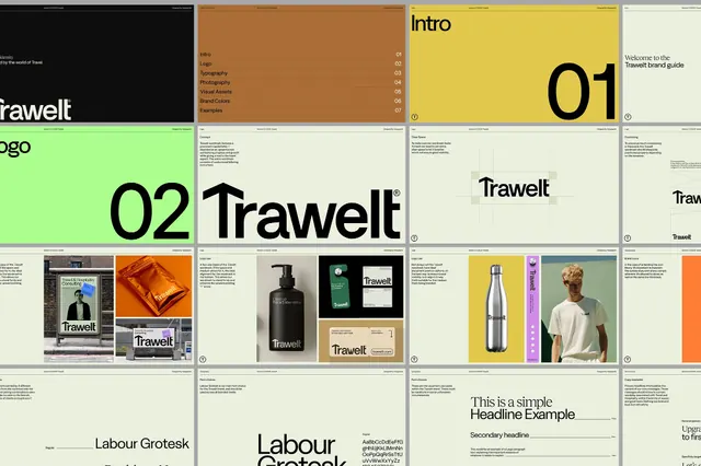
Multi-panel brand identity system for Trawelt, a travel brand, showcasing typography hierarchy, color blocking, photography direction, and product applications.
Summary
Multi-panel brand identity system for Trawelt, a travel brand, showcasing typography hierarchy, color blocking, photography direction, and product applications.
Visual description
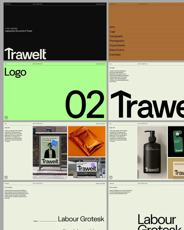
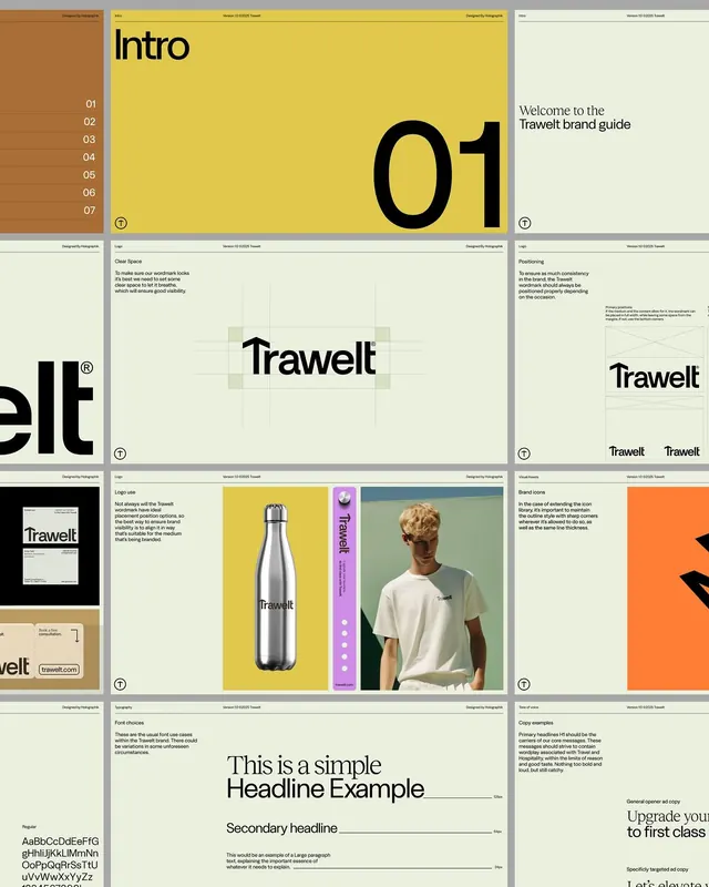
Horizontal strip layout displaying nine branded panels arranged in a grid. Left side features the "Trawelt" wordmark in large sans-serif type with split orange and cream background sections, plus an "Intro" section. Center and right panels show numbered spreads (01, 02), color studies, typography specimens, product photography of travel goods (bottles, packages, textiles), lifestyle imagery with neutral model photography, and supporting layouts demonstrating grid systems and typographic hierarchy. Color palette alternates between cream, bright orange, burnt yellow, forest-green backgrounds with consistent black and cream typography, reinforcing a cohesive warm-yet-refined visual system.
Key takeaway
The disciplined color-blocking approach (each panel uses 1-2 dominant background colors plus type) makes the system memorable without overcomplication. The integration of product photography and actual lifestyle contexts (not abstract mockups) grounds the travel narrative. The sans-serif hierarchy uses size and weight contrast rather than multiple typefaces, keeping the system tight.
Reuse notes
Strong reference for travel, hospitality, or lifestyle brands seeking a modern corporate foundation. The warm earth-tone palette and large geometric typography pair well with photography-forward layouts. Best when the brand can support a full suite of product and lifestyle imagery; the system relies on visual richness across applications to feel complete.
More like this






Keep what you find
A free account saves references to boards and can send you a weekly email of picks based on what you save.
To see every result, go Pro.