Preview image. Unlock full-res
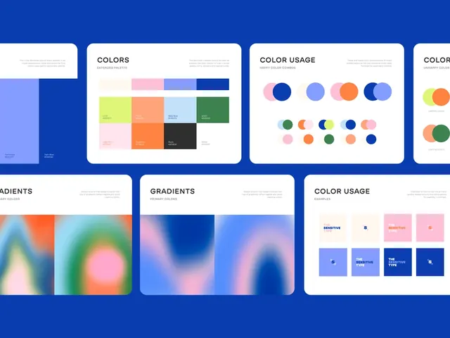
A modular design system reference card displaying discrete color swatches, gradient ramps, and color-usage applications on a deep cobalt blue background.
Summary
A modular reference sheet for a design system, documenting a six-color palette through discrete swatches, smooth gradient ramps, and applied color-usage examples against a deep cobalt background.
Visual description
Multiple white card modules arranged in a two-row grid on a solid cobalt blue background. Top row cards show discrete color swatches (a grid of six or more solid hues including coral, pink, teal, and greens) and a section labeled COLOR USAGE with pairs of circles demonstrating complementary relationships. Bottom row cards display smooth gradient ramps with soft transitions from blue through pink and cyan tones, plus another COLOR USAGE card showing practical color application combinations as small rectangular blocks. Each card uses all-caps sans-serif labels in dark text. White space within each card isolates the color information from the blue field, creating clarity and hierarchy.
Key takeaway
The card-based modular system isolates different color documentation types (swatches vs. gradients vs. usage rules) while maintaining visual cohesion through consistent framing. The contrast between the deep background and white cards ensures the colors read clearly without distortion. Gradient ramps are presented as full smooth transitions rather than discrete steps, showing interpolation potential.
Reuse notes
Ideal for design systems, brand guidelines, or developer documentation where color relationships and usage rules need clear, reproducible reference. The modular card structure scales well to larger palettes or additional system documentation (spacing, typography, components).