Preview image. Unlock full-res
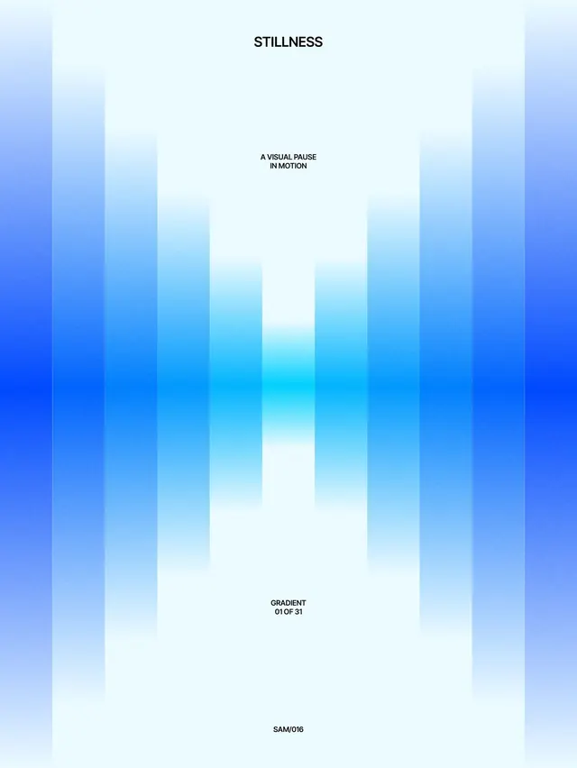
Symmetrical composition of vertical gradient bars in blue tones, framing a centered white space with minimal sans-serif text.
Summary
Vertical gradient bars in shades of blue and cyan frame a centered white area, with text reading "STILLNESS" and "A VISUAL PAUSE IN MOTION" at the top, and "GRADIENT 01 OF 31" and "SAM/016" at the bottom.
Visual description
The entire composition is organized into eight tall vertical bars of equal width, each a distinct gradient strip moving from deep indigo at the outer edges through progressively lighter shades of blue, cyan, and near-white toward the center. The bars alternate between darker and lighter tones, creating a rhythmic, symmetrical visual breathing effect. The center bar is nearly white. White sans-serif text is positioned at the top center reading "STILLNESS", with smaller text "A VISUAL PAUSE IN MOTION" below it. At the bottom center are two additional text lines: "GRADIENT 01 OF 31" and "SAM/016". All typography is clean, sans-serif, and rendered in dark gray or black.
Key takeaway
The repetitive vertical-stripe pattern creates rhythm and depth while remaining minimal and restrained. Centering white space and text against symmetrical gradient bars focuses attention without demanding visual complexity. The subtle color transitions (light-to-dark) can suggest motion or layering even while the overall mood reads as calm.
Reuse notes
Ideal for portfolio work, design case studies, or abstract branding that prioritizes serenity and sophistication. The symmetry works well at large, full-screen scales. Use when you want gradient impact with strong white breathing room. Numbering (01 of 31) suggests this is part of a series, useful for sequential presentations or collection documentation.