Preview image. Unlock full-res
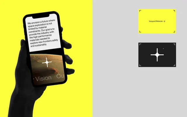
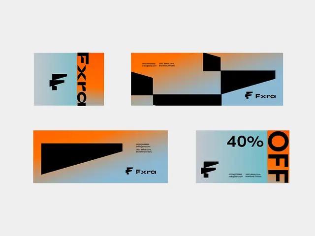
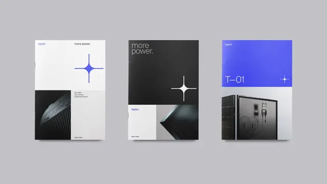
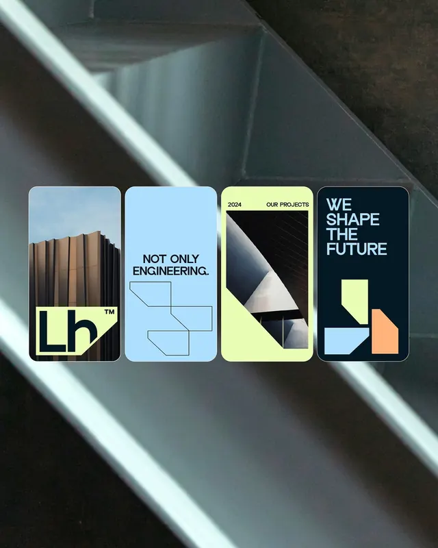
An engineering and architecture firm identity across four modular card applications, combining cool geometries, black text, and bright lime-yellow geometric marks.
Summary
An engineering firm brand identity system applied across four horizontal rectangular cards, each featuring geometric shapes, photography, and a bright lime-yellow mark system against cool-toned backgrounds.
Visual description
Four cards lined horizontally, each with a rounded-corner edge. From left to right: a card with a stacked wood/architectural material texture and a bold yellow TM mark (wordmark); a light blue card with the text "NOT ONLY ENGINEERING" in black sans-serif and a thin geometric line diagram; a yellow-green card labeled "2024" and "OUR PROJECTS" with a split geometric composition (partial photograph meeting angular black shapes); a navy card with the text "WE SHAPE THE FUTURE" in white and a simplified geometric color palette (yellow, light blue, peach shape). The mark system uses a bright lime/chartreuse yellow as a primary accent color. Sans-serif typeface is clean and technical. The overall grid is structured and modular, with consistent card proportions and white borders between elements. The photography is architectural, linking to the engineering/construction narrative.
Key takeaway
The consistent geometric mark system (varying shapes in the same vibrant yellow) across four different card contexts creates instant brand recognition without a literal logo. The two-column text arrangement (subject on left, descriptor on right) is information-efficient. Cool background colors with bright yellow accents creates high contrast and forward-energy while maintaining professional restraint.
Reuse notes
Ideal for engineering firms, architecture studios, or tech companies projecting structural competence and innovation. The modular card system scales well for multi-page applications (brochures, case study decks). The cool palette (slate blue, light blue, charcoal) pairs well with the yellow accent. The geometric line work is subtle enough not to overwhelm.