Preview image. Unlock full-res
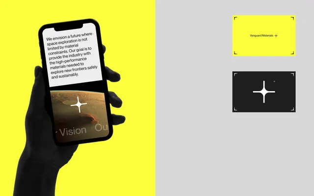
Minimalist materials-science brand pairing a four-pointed star mark with a split-panel layout of intense yellow and neutral gray.
Summary
A corporate identity for Vanguard Materials using a clean four-pointed star mark and split-panel branding system that combines deep black and bright yellow.
Visual description
The left panel features a silhouetted black hand holding a smartphone with a landscape image on its screen, set against a bright yellow background. A quote wraps around the hand, reading in part "We envision a future where space exploration is not limited by material constraints." The right panel shows the brand identity on a light gray background: the wordmark "Vanguard Materials" in yellow within a framed box, and below it, a white four-pointed star icon centered on deep black. Clean, minimal sans-serif type is used throughout.
Key takeaway
The split-panel composition that balances product context (left, human and tactile) with pure brand identity (right, abstract and iconic). The four-pointed star as a memorable, simple mark that reads equally well at large and small scales. The color strategy using only three tones (yellow, black, gray, white) that creates instant visual differentiation.
Reuse notes
Ideal for tech, materials, or innovation-driven B2B brands seeking a forward-thinking, serious aesthetic. The star mark abstracts concepts like exploration or precision without being literal. The panel layout works for presentation decks, websites, and environmental graphics.
More like this






Keep what you find
A free account saves references to boards and can send you a weekly email of picks based on what you save.
To see every result, go Pro.