Preview image. Unlock full-res
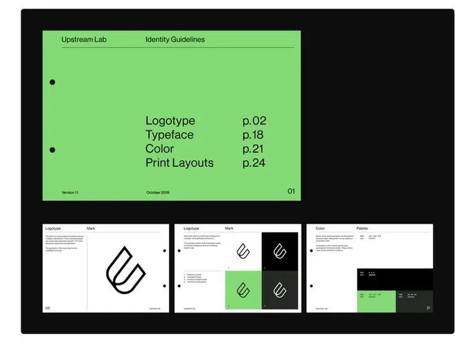
Design system overview page for Upstream Lab with a monochromatic palette, modular logo mark variations, and a detailed table of contents structure.
Summary
The cover page of the Upstream Lab identity guidelines, presenting a table of contents for logo, typeface, color, and print layouts in a minimal, systematized layout.
Visual description
A horizontal sheet mounted in a black frame. The top half is a bright lime-green panel with a centered table of contents: "Logotype" (p. 02), "Typeface" (p. 18), "Color" (p. 21), "Print Layouts" (p. 24), each with a corresponding page number right-aligned. Two small black dots anchor the left edge. The page number "01" and version date "October 2018" sit in the lower corners. Below the green cover panel is a three-panel grid showing the mark in three states: first as a thick outlined shape on white, second as variations (outline, solid, nesting on lime and black backgrounds), and third as a color palette swatch with labeled boxes in black, green, and gray tones. All typography is in a geometric sans-serif with clean line spacing and generous margins.
Key takeaway
The use of a single bright accent color as a content callout while maintaining overall monochromatic restraint. The modular mark system shown in a small grid beneath the cover demonstrates how to compress trademark usage rules into space-efficient documentation. The consistent use of rule lines, dots, and alignment creates a systematic, confident feel.
Reuse notes
Ideal for design-system covers and brand-guideline documents. The lime accent would translate to other sectors. Works well for tech, media, or innovation-focused brands that need to assert precision without coldness.