Preview image. Unlock full-res
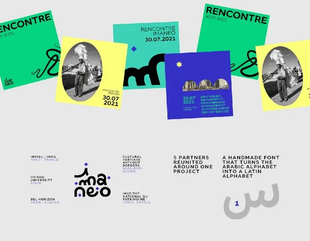
Contemporary exhibition identity featuring tilted rectangular color blocks (neon green, bright yellow, cobalt blue, teal) layered with photography, typography, and a custom monogram logotype.
Summary
Contemporary exhibition branding system combining tilted neon-bright color blocks (green, yellow, blue, teal) with black-and-white photography, custom monogram logo, and structured typography.
Visual description
Layered composition arranged as a collage of tilted rectangular cards at varying angles, creating visual rhythm and dynamism. Neon-bright color blocks (lime green, bright yellow, cobalt blue, teal) are rotated 15-25 degrees off-horizontal, each holding typography, photography, or leaving negative space. Black-and-white oval photography (portrait-oriented figures) appears on several cards. A central custom monogram logotype (stylized angular letterforms) anchors the composition. Below this hero section, a grid layout displays partner logos, text blocks, and a bold custom typeface sample showing an Arabic alphabet conversion ("handmade font turns Arabic into Latin alphabet"). Typography is clean sans-serif, mostly dark on light or light on dark, with all-caps display headlines. The overall field is light gray, allowing the neon blocks and black-and-white photography to pop. Date and institutional text appear in small print.
Key takeaway
The tilted-card technique is an accessible way to inject energy and playfulness into institutional or exhibition branding. The neon-color palette against a neutral field creates high visual impact without overwhelming. Using just black-and-white photography within the color blocks maintains sophistication. The system is modular: each card stands alone but works within the larger grid, making it adaptable to different formats and content without losing cohesion.
Reuse notes
Strong for cultural institutions, design conferences, contemporary art, and youth-facing nonprofits that want energy without chaos. The neon palette requires careful placement to avoid visual noise; best used with generous whitespace. The system works at multiple scales from small cards to large posters. Pairs well with modern sans-serif body copy and clean grids. The tilted angle can feel dated if overused; treat it as a signature, not a default.
More like this

Keep what you find
A free account saves references to boards and can send you a weekly email of picks based on what you save.
To see every result, go Pro.