Preview image. Unlock full-res
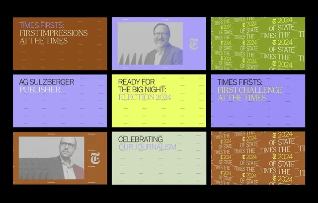
Editorial design grid showcasing typographic variety across nine layouts with bold headlines and portraits, using warm and cool accent colors.
Summary
A nine-panel editorial design grid for The Times publication, demonstrating headline treatments and layout patterns across varied color backgrounds with monochromatic photographic elements.
Visual description
The composition is a 3x3 grid of distinct editorial layouts, each with a different solid-color background (burnt orange, lavender, lime-green, or pale green). Each panel contains bold all-caps black headlines set in a large sans-serif typeface, layered with grayscale photographs of people and supporting copy in smaller type. Headlines include phrases like "Times Firsts. First Impressions At The Times," "Ready For The Big Night: Election 2024," "Celebrating Our Journalism," and repeated "Times The Of State 2024" patterns. Some panels use the publication's serif accent mark (the T symbol) as an accent. The overall effect is modular and highly flexible, showing how a single typographic system can adapt across multiple color environments while maintaining visual unity.
Key takeaway
The modular headline treatment creates a flexible brand system that can address multiple editorial angles using consistent typography. Bold color blocking (each panel a different hue) prevents monotony while the same typeface keeps cohesion. The sparing use of photography (small scale, monochromatic) ensures type remains dominant. The serif accent mark provides a consistent brand anchor across shifts in layout.
Reuse notes
Excellent reference for news and magazine publication design systems. The approach works for landing pages, article series, editorial calendars, and promotional campaigns. The color variety demonstrates how a single typeface works across warm and cool environments. Best used when typography is the primary design variable and photography plays a supporting role. Not suitable for image-heavy content or photographic hero layouts.
More like this
Keep what you find
A free account saves references to boards and can send you a weekly email of picks based on what you save.
To see every result, go Pro.