Preview image. Unlock full-res
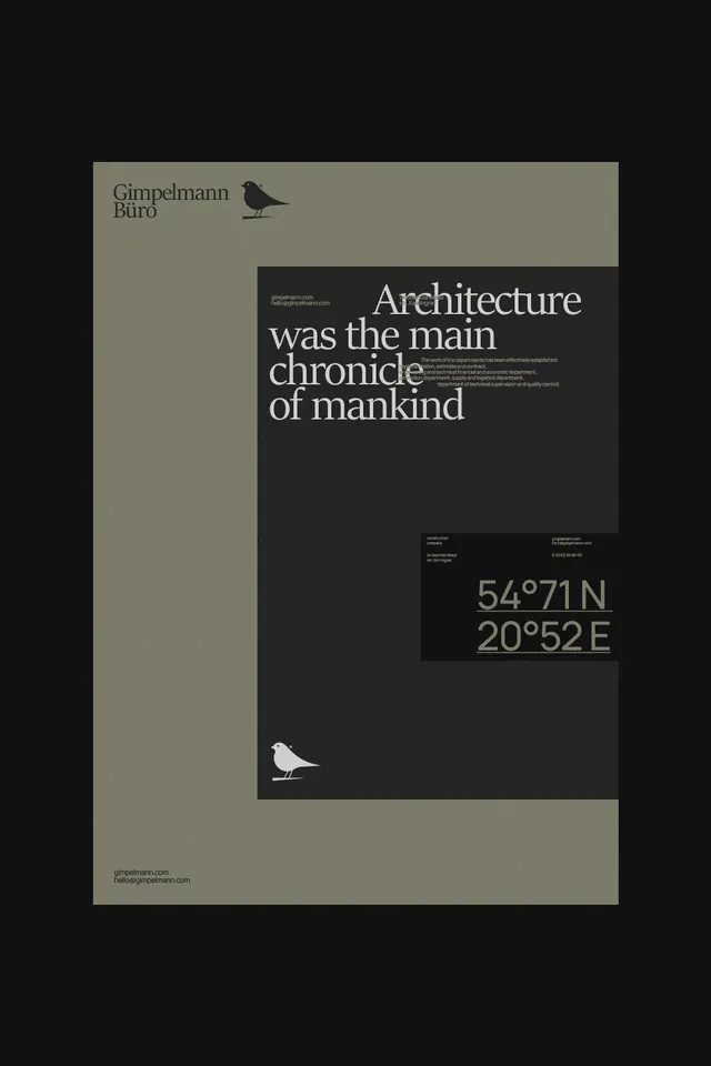
Minimalist design poster splits sage-green and charcoal-black halves with serif headline 'Architecture was the main chronicle of mankind,' small bird icons, and coordinates at the bottom.
Summary
A split-color poster for Gimpelmann Büro features a bold serif-type headline on a charcoal field, paired with a sage-green sidebar, small bird icon details, and latitude/longitude coordinates.
Visual description
Portrait-oriented poster divided vertically: left half sage-green (#7C7B69), right half deep charcoal-black (#111111). Top-left corner displays "Gimpelmann Büro" in small sans-serif above a silhouetted bird. Center-right: a large serif headline in white reading "Architecture was the main chronicle of mankind" with small descriptive text in sans-serif below. Bottom-right quadrant holds coordinates in tan (54°71N 20°52E) in monospace. A second bird silhouette sits at bottom-left. Contact information runs along the bottom-left margin in white sans-serif.
Key takeaway
The split-field color blocking as a layout device—it creates immediate visual hierarchy and divides the composition without needing a rule line or grid. The serif headline in a classical typeface (likely a stock serif) anchors authority while coordinates suggest place or research. The repeated bird symbol becomes a subtle brand mark. The asymmetric placement of text and icon feels deliberate, not random.
Reuse notes
Strong template for architecture, consulting, or design-agency collateral. The neutral palette (taupe and black) feels timeless and expensive. The serif typeface must be chosen carefully to match the architect/agency's personality (modernist, classic, or geometric serifs all work). Coordinates can be swapped for project location. Works as a poster, business card, or digital banner background.
More like this







Keep what you find
A free account saves references to boards and can send you a weekly email of picks based on what you save.
To see every result, go Pro.