Preview image. Unlock full-res
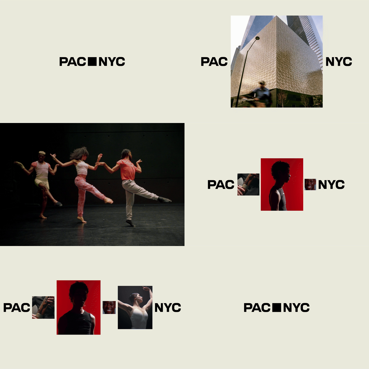
A minimalist wordmark logo for PAC NYC with a solid black square substituting one letter, creating a strong geometric mark on cream background.
Summary
A minimalist wordmark logo for PAC NYC where a solid black square replaces a letterform within the sans-serif word, functioning as both mark and structural element.
Visual description
Horizontal wordmark in heavy-weight sans-serif type spelling "PAC" followed by a filled black square and "NYC". The square sits inline with the letters, creating a distinctive geometric focal point. Centered composition on a light cream background. The simplicity and bold weight of the typeface emphasize the clean, institutional character of the mark.
Key takeaway
The letterform-substitution technique: replacing one letter with a geometric shape (here a square) can anchor an identity and serve as a memorable icon. The monochromatic treatment emphasizes clarity. The negative space and balance between type and the geometric element feel both contemporary and institutional.
Reuse notes
Strong for nonprofits, cultural institutions, or modern brand systems needing a compact, recognizable mark. Works equally well at any scale. Pairs well with minimal supporting typography and generous white space.