Preview image. Unlock full-res
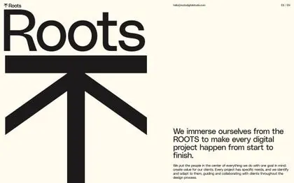
Roots brand identity with a bold geometric upward arrow formed by a cross and diverging lines, paired with clean sans-serif wordmark on off-white background.
Summary
Roots is a digital services brand built on a geometric upward arrow mark where a vertical stem branches into two diverging diagonal lines, paired with compact sans-serif logotype set on warm cream background.
Visual description
A vertical cross-and-arrow mark dominates the upper-left composition: a thick vertical stem splits cleanly into two symmetric 45-degree diagonal strokes pointing upper-left and upper-right, forming a confident upward chevron suggesting growth and foundation. The wordmark "Roots" sits immediately below in a modern, condensed sans-serif in solid black, letter-spaced tightly for impact. A small monospaced URL text appears top-right. The entire composition floats on an off-white/cream background with generous margin. Heavy sans-serif type and pure black strokes create maximum readability and presence even at small scales.
Key takeaway
The branching-divergence metaphor: a single stem becoming two paths is both literally "rooted" and symbolically uplifting, solving the brand brief in one mark. The tight, compact logotype treatment (short x-height, condensed spacing) pairs perfectly with the bold geometric mark without competing. The warm off-white ground softens the stark black-on-white contrast while maintaining legibility.
Reuse notes
Strong starting point for B2B tech, consultancy, and developer-tool brands (the growth + stability balance is especially apt for platforms, infrastructure, or agency identities). The mark's clarity and simplicity work across favicon, app icon, and large-format applications. Relies on sufficient breathing room to avoid feeling cramped; avoid pairing with heavily overlaid imagery or dense body copy at its scale.