Preview image. Unlock full-res
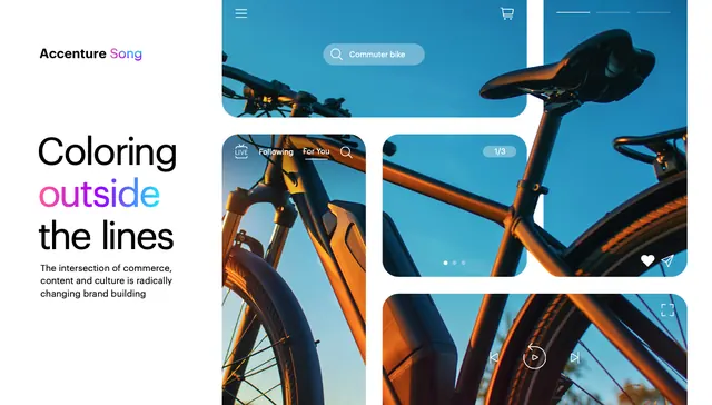
Magazine spread for bicycle brand with headline 'Coloring outside the lines' set above a grid of cropped high-contrast hero shots of bikes in teal sky and orange-brown tones.
Summary
Magazine spread announcing a cycling brand campaign with a bold multi-line headline and a four-image grid of tightly cropped, high-contrast bicycle hero shots against bright sky and warm metal tones.
Visual description
A three-column layout begins with the Adventurio logo at top-left, followed by a headline in sans-serif where "Coloring" and "the lines" are black and "outside" is set in a hot magenta accent. Below sits a subheading and descriptive copy in smaller type. The right side shows a 2x2 grid of cropped product photography. Each frame isolates a different bicycle detail shot against a clear teal sky (upper-left and right frames) or from below against warm brown-orange seat-tube tones (lower frames). The photography is sharp and sun-lit with strong color contrast between cool sky and warm metal.
Key takeaway
The strategic color callout in the headline (hot pink/magenta on black-and-white text) draws the eye without overwhelming the layout. The high-contrast cropped grid forces the viewer to puzzle out what they are seeing, creating engagement. The color palette (teal sky + warm orange-brown) is cohesive and complementary without being matchy.
Reuse notes
Works well for sports and lifestyle brands that want dynamic, cropped product photography. The headline accent color treatment is especially effective when you want one word or phrase to pop. The grid format is ideal for showing multiple product angles or use contexts quickly.
More like this



Keep what you find
A free account saves references to boards and can send you a weekly email of picks based on what you save.
To see every result, go Pro.