Preview image. Unlock full-res
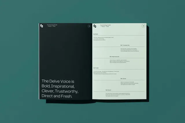
A two-panel brand voice guide pairing a dark panel and cream panel to present contrasting voice characteristics for the Delve brand.
Summary
A split-panel brand voice guide showing voice traits (Bold, Inspirational, Clever, Trustworthy, Direct, Fresh) on a dark teal and cream background, designed for the Delve brand.
Visual description
Two facing panels: a dark teal-black left panel and a cream-white right panel mounted on a warm teal background. The dark panel displays white headline text stating the six voice characteristics as an impactful list. The cream panel is a detailed form showing attribute columns with sections for Voice, Description, Do's, and Don'ts, formatted as a reference grid. Both panels are mounted as physical mockups with visible white corner mounts, creating a layered, gallery-style presentation. Sans-serif typography in white and dark gray ensures high contrast and readability across both surfaces.
Key takeaway
The dual-contrast approach: placing inverse color schemes (dark with light text, cream with dark text) side by side creates visual rhythm while clarifying tone. The form-like grid on the right (columns for attributes, descriptions, rules) is a reusable pattern for brand-voice systems. The physical mockup treatment (visible mounts, depth) elevates a flat guideline into a tangible artifact.
Reuse notes
Ideal for brand voice guides, especially for B2B or corporate products where personality and language guidelines are critical. The two-panel layout works for any paired concept (Do/Don't, Light/Dark, Voice/Application). Works best on warm or neutral backgrounds that complement the dark and light panels.
More like this







Keep what you find
A free account saves references to boards and can send you a weekly email of picks based on what you save.
To see every result, go Pro.