Preview image. Unlock full-res
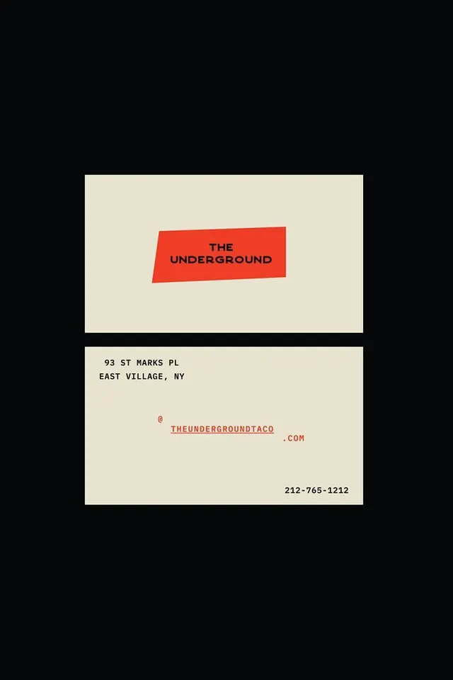
A two-sided business card for The Underground taco shop, front and back shown on black, with a red parallelogram logo block and monospaced contact details in red and black.
Summary
Both faces of a cream business card for The Underground (a New York taco spot) floated on a black background, defined by a skewed red parallelogram holding the logotype and a sparse, monospaced contact layout.
Visual description
Two horizontal cards stack on a full black field. The top card centers a leaning red parallelogram block; inside, THE UNDERGROUND is set small and tight in bold black caps over two lines. The bottom card is the back: a cream rectangle with the address 93 ST MARKS PL / EAST VILLAGE, NY upper-left in black mono caps, a centered handle THEUNDERGROUNDTACO with the @ in red and .COM trailing, and a red phone number 212-765-1212 anchored bottom-right. The whole system runs on three colors only: near-black, warm cream, and a single hot red, with typewriter-like monospaced text giving it a utilitarian feel.
Key takeaway
Skewing the logo into a leaning red block gives an otherwise flat card motion and a sense of place (a downward, underground tilt). Scattering monospaced details to opposite corners with lots of cream void reads as confident and editorial rather than empty.
Reuse notes
Good model for a restaurant, bar, or local-business stationery system that wants retro-utilitarian warmth on a tight three-color budget. The single skewed accent block plus mono type is easy to extend to menus, signage, and packaging. Caveat: the corner-anchored layout needs generous margins to avoid feeling sparse at small print sizes.
More like this

Keep what you find
A free account saves references to boards and can send you a weekly email of picks based on what you save.
To see every result, go Pro.