Preview image. Unlock full-res
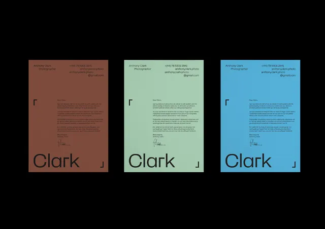
Three-color letterhead system for Clark featuring a lowercase wordmark and geometric mark, each printed on distinct earth-toned, cool-toned, and light backgrounds.
Summary
A three-variant letterhead system where the same minimal Clark wordmark and geometric mark appear on clay-rose, sage-green, and sky-blue A4 sheets, each with flush-left body text and contact information in small sans-serif.
Visual description
Three A4 letterheads arranged side by side, each printed on a distinct muted background: warm clay-brown, cool pale sage-green, and sky blue. All three carry the same visual hierarchy: small geometric lowercase "r" mark at top left, large "Clark" wordmark in lowercase sans-serif positioned prominently in the lower third, and body text (contact info, descriptive copy) in small, tightly-spaced sans-serif above and to the left of the name. The layouts are identical; only the color grounds change. Typography is restrained and left-aligned. The dark type remains consistent across all three backgrounds.
Key takeaway
The color-as-system approach: one identity applied across discrete background colors to signal flexibility without redesigning the mark or layout. The discipline of white space and a single entry point (the geometric mark) that anchors hierarchy across all variations.
Reuse notes
Works for service-based or creative industries where breadth of work (via color switching) matters more than uniform branding. Best when the mark is strong enough to read on all chosen colors. The vertical proportions favor print and formal contexts over digital.
More like this





Keep what you find
A free account saves references to boards and can send you a weekly email of picks based on what you save.
To see every result, go Pro.