Preview image. Unlock full-res
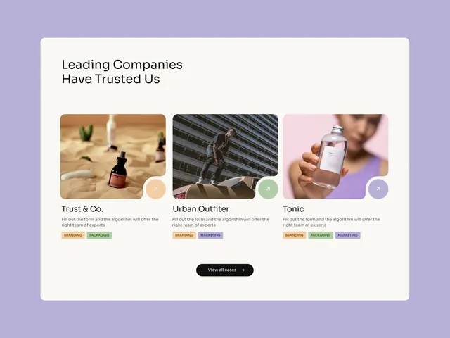
A testimonial section pairing a headline with three photographic client case study cards on a lavender background, each with a rounded image, company name, and topic tags.
Summary
A testimonial/case-study section with three photographed client projects displayed in rounded-corner cards against a soft lavender background, paired with a headline and a bottom CTA button.
Visual description
Lavender background. Rounded white container card, left-padded layout. Headline "Leading Companies Have Trusted Us" in dark sans-serif. Below: three equal-width cards in a horizontal grid, each rounded. Each card shows a photograph (a cosmetic serum on natural texture, a bronze figure at modern architecture, a hand holding a bottle on pink), a small circular branded dot (tan, sage, purple respectively), below which sits a company name ("Trust & Co.", "Urban Outfitter", "Tonic"), descriptive copy, and three small category badges (colors muted tan/sage/purple, text "BRANDING", "PACKAGING", "MARKETING" in caps). Bottom center: "View all cases" button in black with arrow. Spacing is generous; type is small but legible. Warm product photography contrasts softly against cool lavender.
Key takeaway
Three-column case-study grids with small category badges reduce cognitive load and signal scope breadth. Rounded cards + lavender background soften corporate feel and feel more approachable. Photographed products (not rendered mockups or generic imagery) build tangible trust. The small circular brand dot above each card creates a visual anchor and brand integration point.
Reuse notes
Strong for B2B and agency trust-building sections. Works well on service/consulting homepages when you have real project photography. Testimonial photography should be lifestyle or product-focused, not abstract. Pair with trust copy (case outcome, client quote, metric) for maximum impact. Lavender/muted-tone background feels contemporary; swap to lighter or darker if brand identity demands contrast.
More like this



Keep what you find
A free account saves references to boards and can send you a weekly email of picks based on what you save.
To see every result, go Pro.