Preview image. Unlock full-res
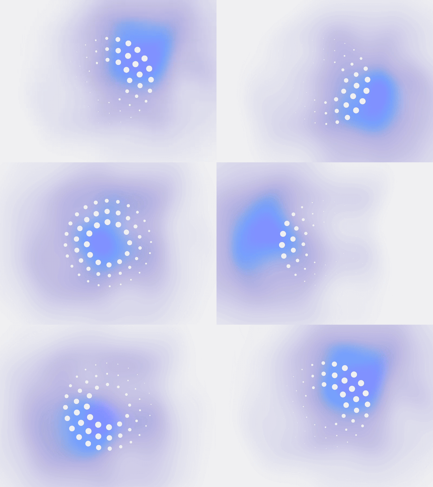
A dreamy, diffuse gradient field flowing from pale lavender through mauve to cobalt, punctuated by scattered white circular particles that suggest light or motion.
Summary
A soft, diffuse gradient field that transitions from pale lavender to cobalt blue, adorned with scattered white circles creating a bokeh or particle-dispersion effect suggesting light and motion.
Visual description
The composition is a full-frame color field with no hard edges or composition lines. The gradient originates in off-white or very pale lavender in the upper left, flows through soft mauve and purple tones in the center, and deepens to bright cobalt blue in the lower right quadrant. The overall effect is a gentle radial bloom centered mid-frame. Scattered white circles of varying sizes are distributed across the gradient, denser and larger toward the center and thinning at the edges, mimicking particle bokeh or light spots. The circles appear soft, possibly with slight blur or anti-aliasing. The entire composition is matte, with no gloss or specular highlights. The aspect ratio suggests a square or nearly square frame.
Key takeaway
The particle bokeh technique adds perceived motion and dimensionality to a static gradient field without introducing recognizable subject matter. The cool color palette paired with the soft particle effect creates an inherently calming, trustworthy tone. This pattern works equally well as a background, a logo mark, or a brand asset and remains flexible enough to overlay with typography or imagery.
Reuse notes
Excellent for saas, consumer apps, or tech brands aiming for a modern, accessible, non-corporate feel. Works as a hero background, splash screen, loading animation frame, or icon shape. The pale-to-saturated gradient and cool temperature suit fintech, productivity, or wellness contexts. Avoid pairing with heavy serif or ornate typefaces; keep companion typography clean and minimal. The soft focus means it reads well at any size and on screens ranging from mobile to desktop.