Preview image. Unlock full-res
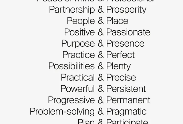
A vertical typographic study of organizational values presented as paired words (Partnership & Prosperity, People & Place, etc.) in monochrome sans-serif without ornamentation.
Summary
A vertical typographic study of organizational values presented as paired words (Partnership & Prosperity, People & Place, etc.) in monochrome sans-serif without ornamentation.
Visual description
A centered column of text lines in a clean, modern sans-serif typeface (appears to be a display or headline weight), each line reading a concept pair separated by an ampersand: "Peace of Mind & Professional", "Partnership & Prosperity", "People & Place", "Positive & Passionate", "Purpose & Presence", "Practice & Perfect", "Possibilities & Plenty", "Practical & Precise", "Powerful & Persistent", "Progressive & Permanent", "Problem-solving & Pragmatic", "Plan & Participate". The text is set in dark grey or charcoal on a near-white background. No decorative elements, bullets, or illustrations appear. The consistent line height and uniform weight create a calm, organized rhythm.
Key takeaway
The pairing technique (noun & adjective, or concept & concept) is memorable and creates a parallel structure that feels authoritative without being rigid. The reliance on typeface alone, with no icons or graphics, gives the system flexibility and scalability. The display-weight typography makes even a simple list feel designed and intentional.
Reuse notes
Strong for corporate brand identity systems, consulting firms, nonprofit missions, and values-driven companies. The austere aesthetic works for B2B contexts; less suited to playful or consumer-facing brands. The paired-concept pattern is highly reusable for any organizational manifesto. The monochrome palette means this works on any background with sufficient contrast; consider a tinted background or accent color to add warmth if the context permits.
More like this





Keep what you find
A free account saves references to boards and can send you a weekly email of picks based on what you save.
To see every result, go Pro.