Preview image. Unlock full-res
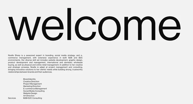
Landing page specimen for a brand consultant featuring a bold welcome message and a structured list of service areas set in clean sans-serif type.
Summary
A consultant's personal branding specimen using massive hierarchical sans-serif type and generous whitespace to showcase services and professional identity.
Visual description
The page is organized with a large "welcome" headline spanning the upper half in a bold, geometric sans-serif. Below is a compact bio paragraph in small text, followed by an indented list of service categories (Brand Identity, Creative Direction, Product Development, E-commerce Management, Social Media Consulting, Art Direction, B2B/D2C Consulting). The background is off-white with dark text, creating stark contrast. Margins are wide and symmetrical, letting typography breathe.
Key takeaway
The scale jump between headline and body type creates instant hierarchy without color or decoration. The organized service list functions as both content and design grid, showing that structure itself is design. Whitespace is weaponized to make a short list feel architecturally important.
Reuse notes
Works best for consultant portfolios, agency overviews, and professional service firm homepages. The minimalist treatment reads sophisticated but requires genuinely strong typography to avoid looking cold or corporate-bland. Pair with refined serif or geometric sans-serif only.
More like this








Keep what you find
A free account saves references to boards and can send you a weekly email of picks based on what you save.
To see every result, go Pro.