Preview image. Unlock full-res
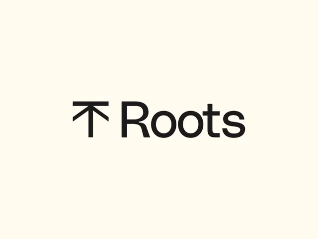
A geometric wordmark for Roots pairing a bold upward arrow with geometric sans-serif lettering, centered on cream.
Summary
A geometric wordmark for Roots pairing a bold upward arrow with geometric sans-serif lettering, centered on cream.
Visual description
Centered composition on a cream background. A solid black upward-pointing arrow sits directly above or integrated with the word "Roots" in a bold, geometric sans-serif. The letter forms are constructed from uniform stroke weight and clean angles, with generous letter spacing. The arrow is simplified to essential geometric planes: a vertical stem with angled top bar and right-leaning serifs. No decorative elements. The entire mark sits as a stable, balanced unit with substantial white space around it.
Key takeaway
The directional arrow combining with type as a single unified mark rather than a layered symbol. The geometric construction of the letterforms creates rhythm that the arrow reinforces. Clean, confident geometry without ornamentation suggests growth, origin, or upward momentum while staying rigorously minimal.
Reuse notes
Effective for purpose-driven or sustainability-focused brands where the arrow reads as "growth" or "roots going up". The geometric sans-serif works as a full wordmark without additional logomark. Best at substantial sizes where the geometric proportions read clearly; at small scale the stroke weights may compress.
More like this



Keep what you find
A free account saves references to boards and can send you a weekly email of picks based on what you save.
To see every result, go Pro.