Preview image. Unlock full-res
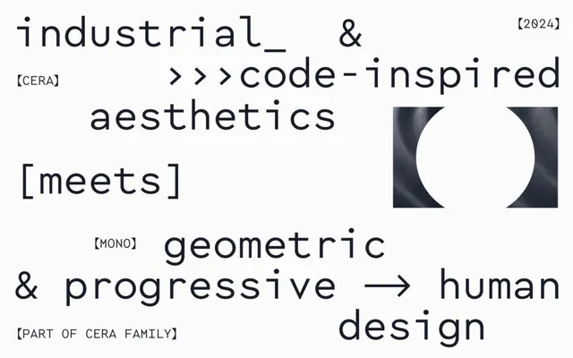
A dense, left-aligned typographic composition layering industrial terminology, technical brackets, and code-style conventions alongside a circular geometric cutout.
Summary
A left-aligned typographic composition mixing technical language (industrial, code, geometric, human design), bracketed tags, and a stark circular negative-space mark on the right.
Visual description
Large sans-serif display type dominates the left two-thirds: "industrial_&" in a tall, open-spaced font, followed by "code-inspired aesthetics" in italic. Below, bracketed labels like [CERA], [meets], [MONO] punctuate the text in smaller monospace, creating a data-structure or code-file appearance. A line of smaller type reads "geometric & progressive arrow human design" with right-pointing arrows as connectors. At bottom, [PART OF CERA FAMILY] anchors the piece in a technical note. On the right, a stark circular cutout in dark charcoal-gray, with a white circle inside, provides geometric contrast. The background is off-white; all text is dark gray or black.
Key takeaway
The mixing of scales and weights (large display + small monospace brackets) creates visual hierarchy without losing the sense of a unified system. The circular geometric mark becomes a powerful visual anchor when text-heavy layout needs a breathing point. The bracket notation (code-style metadata) adds conceptual depth and reads as contemporary design thinking.
Reuse notes
Excellent for tech brands, developer-tool marketing, or any high-design studio wanting to signal technical sophistication. The code-inspired aesthetic pairs well with modernist geometric marks. Works in print (reports, posters, mailers) and digital (hero sections, case studies). Can feel cold or exclusionary if overused; best as a campaign accent or cover statement, not full page.
More like this





Keep what you find
A free account saves references to boards and can send you a weekly email of picks based on what you save.
To see every result, go Pro.