Preview image. Unlock full-res
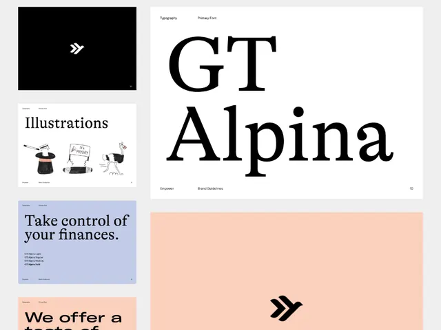
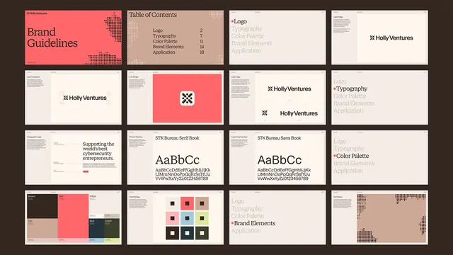
A brand guidelines page showcasing GT Alpina serif typeface alongside modular illustrations, financial app mockups, and identity system components in dual-tone sections.
Summary
A brand guidelines page showcasing GT Alpina serif typeface alongside modular illustrations, financial app mockups, and identity system components in dual-tone sections.
Visual description
The page presents a cohesive brand system across five panels. Upper left: black background with white double-arrow symbol. Below: "Illustrations" section with three line-drawn icons (hourglass, document, figure). Center: large serif headline "GT Alpina" in black on white, labeled "Typography - Primary Font". Lower sections: a light blue panel with white text reading "Take control of your finances" and a peach-pink panel with black double-arrow symbol and partial text "We offer a". Visual language emphasizes clean spacing, typographic hierarchy, and high contrast between panels.
Key takeaway
The modular panel layout that separates typeface from illustrations, UI samples, and brand colors without requiring a dense grid. The double-arrow symbol as a cohesive motif. The serif/sans pairing (serif for display, sans for UI) as a clear typographic system.
Reuse notes
Use as a reference for guidelines documents in fintech and marketing sectors. The modular card approach scales well for multi-section systems. The typeface-first layout works when the primary asset is a custom serif.
More like this






Keep what you find
A free account saves references to boards and can send you a weekly email of picks based on what you save.
To see every result, go Pro.