Preview image. Unlock full-res
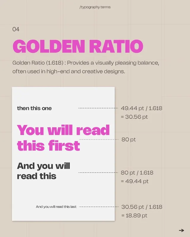
A typographic specimen that uses the Golden Ratio (1.618) to derive a hierarchical type scale, demonstrating mathematical precision in display typography.
Summary
A typographic specimen that uses the Golden Ratio (1.618) to derive a hierarchical type scale, demonstrating mathematical precision in display typography.
Visual description
Against a light tan grid background, a centered white card displays a progressive type scale in hot magenta and dark gray sans-serif. The heading "GOLDEN RATIO" in oversized magenta caps sits above explanatory text defining the 1.618 ratio as a tool for high-end and creative design. Below, a series of four text samples with dotted guidelines show how multiplying and dividing by 1.618 yields the proportional relationships: "then this one" at 49.44pt, "You will read this first" at 80pt, "And you will read this" at 80pt divided by 1.618 (49.44pt), and the smallest line at 30.56pt divided by 1.618 (18.89pt).
Key takeaway
Visualizing an abstract ratio as a live, working type scale makes the principle tangible and reproducible. The magenta accent on neutral background isolates the primary hierarchy signal. Showing the mathematical formula and point-size annotations makes this a reference tool, not just eye candy.
Reuse notes
Ideal for design systems documentation, design-school materials, or editorial work targeting designers. The approach scales to any ratio or spacing system (8px grids, 4:3:2 type scale, etc.). The white card creates clear contrast against the grid, making it work at thumbnail size.
More like this






Keep what you find
A free account saves references to boards and can send you a weekly email of picks based on what you save.
To see every result, go Pro.