Preview image. Unlock full-res
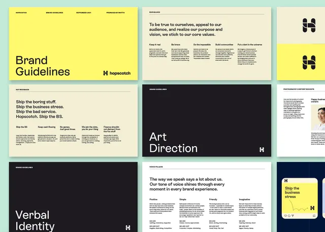
A comprehensive brand guidelines system with high-contrast typography, structured grid layout, and strategic use of bright yellow as the accent color against black, white, and neutral tones.
Summary
A complete brand guidelines specimen showing a cohesive system of type, color, and layout rules unified by high contrast and strategic yellow accents.
Visual description
A grid of six distinct sections, each demonstrating different brand elements. Top left: cream background with "Brand Guidelines" headline in a bold sans-serif and smaller black text explaining purpose. Top right: editorial layout with multiple paragraphs and a branded mark (H in a circle). Center row: a solid black section with white "Art Direction" title and descriptive text; next to it, a cream panel with "Verbal Identity" and detailed typographic guidelines. Bottom row: structured grids of text samples, typography scales, and labeled sections, all maintaining strict alignment and generous white space. A single bright yellow accent bar runs horizontally, pulling focus and breaking the black/cream/white palette. Overall impression is authoritative, systematic, and precisely executed.
Key takeaway
The restraint of the color palette (only three neutrals plus one bright accent) making the yellow feel essential rather than decorative. The nested grid system where each panel contains a sub-grid, creating visual rhythm without fragmentation. The strategic use of one typeface family at multiple scales to establish hierarchy while maintaining cohesion.
Reuse notes
Strong reference for brand guidelines, design systems, and editorial branding work. The yellow accent model works well for B2B, media, or marketing-facing materials. Watch the scale: six panels require generous canvas space to breathe.
More like this
Keep what you find
A free account saves references to boards and can send you a weekly email of picks based on what you save.
To see every result, go Pro.