Preview image. Unlock full-res
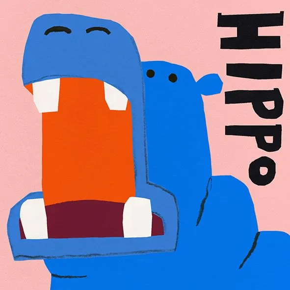
A friendly blue hippo character with an orange mouth and minimalist face on a soft pink ground, paired with bold black typography.
Summary
A friendly blue hippo mascot with a large orange mouth, minimal white eyes, and bold sans-serif wordmark on a warm pink background, designed for children's or consumer branding.
Visual description
The composition centers a chunky, rounded blue hippo head with a proportionally large orange rectangular mouth, two white eyeholes, and a stubby black pupil in each. White accents at the mouth corners suggest teeth. Behind and to the right sits the brand name "HIPPO" in heavy, stacked black sans-serif capitals. The entire scene sits on a flat, uniform soft pink background with no additional detail or shading, creating a playful, approachable visual.
Key takeaway
The contrast between the warm pink ground and cool blue character; the confident use of flat color blocks with no gradients or shadows; the way the black typography sits comfortably on the pink, reading clearly without boxing or backgrounds. The mouth as a large, distinct orange form is the character's focal point and carries most of the personality.
Reuse notes
Strong fit for kids' apps, toy brands, and social platforms targeting young audiences. The roundness and simplified forms work well at small sizes. Scale the thick black type boldly against the character to maintain legibility. The warm-cool pairing is less typical than pastels and can feel refreshing on casual brands.
More like this


Keep what you find
A free account saves references to boards and can send you a weekly email of picks based on what you save.
To see every result, go Pro.