Preview image. Unlock full-res
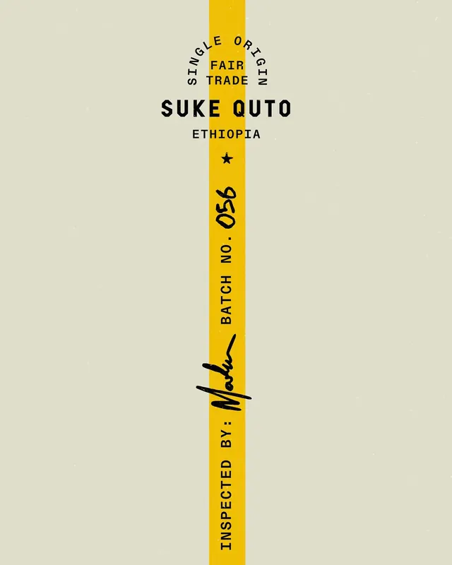
Vertical coffee package label with bold sans-serif main type anchored by a bright yellow stripe, origin and batch info set perpendicular.
Summary
Vertical coffee package label with bold sans-serif main type anchored by a bright yellow stripe, origin and batch info set perpendicular.
Visual description
A cream-colored label running vertically, dominated by a bold golden-yellow band that runs the full height and serves as the visual anchor. Black all-caps sans-serif type is arranged both perpendicular to and along the yellow spine: "SINGLE ORIGIN" and "FAIR TRADE" sit perpendicular at top, "SUKE QUTO" reads horizontally in heavyweight letters, "ETHIOPIA" anchors below, followed by a small black star. Running down the yellow stripe are stacked type elements "BATCH NO. 056" and "INSPECTED BY:" with a handwritten signature detail crossed through the stripe. The overall composition is strictly linear and vertical, with typography as the only visual device.
Key takeaway
The yellow vertical axis creates a clean focal point without needing imagery or illustration. The perpendicular labeling (origin, certifications) stands apart from the product name, allowing quick visual scanning of both product identity and traceability without clutter.
Reuse notes
Strong model for food and beverage labels where authenticity and origin matter. The handwritten signature detail adds trust and craft without looking precious. Works best when actual batch/inspection data can be meaningful rather than decorative.
More like this






Keep what you find
A free account saves references to boards and can send you a weekly email of picks based on what you save.
To see every result, go Pro.