Preview image. Unlock full-res
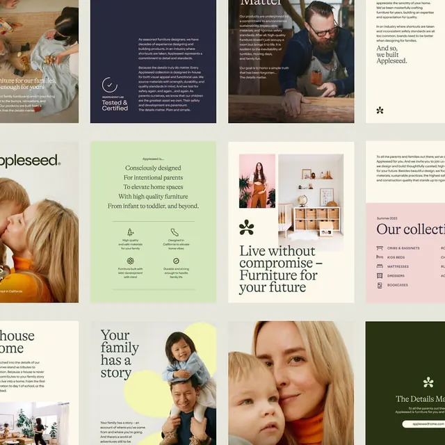
Furniture brand visual system pairing lifestyle photography, minimal typography, and warm earthy tones to target intentional parents and high-quality home spaces.
Summary
Appleseed is a furniture brand for intentional parents and families. The system combines warm photography of real interiors and parents with children, serif headlines in a classic tone, icons for key brand attributes (testing, design, durability), and a minimal palette anchored on cream, warm brown, and muted sage.
Visual description
The page grid mixes full-width photography with type-driven blocks on cream and sage backgrounds. Lifestyle shots show furnished interiors, parents with children, craft details like woodworking. Serif display type (likely a traditional serif font) anchors headlines like "Appleseed is" and "For intentional parents." Left-aligned body copy in a warm grey pairs with minimalist icons (certification mark, hand symbol, furniture stack). A warm brown accent color ties navigation elements and brand marks (a six-point asterisk). The system is light, spacious, and generous with white space between sections.
Key takeaway
The use of warm-toned lifestyle photography to convey handmade quality and family values. The paired serif headlines and body copy in a sophisticated tone. The visual identity (asterisk mark) applied consistently as a small accent, never dominating. The color harmony of warm browns, cream, and muted greens that feels timeless rather than trendy.
Reuse notes
Ideal for furniture, home-goods, or family-focused brands targeting affluent, design-conscious parents. Works well for e-commerce or direct-to-consumer stories. The warm palette and serif type suggest quality and heritage; pair with lifestyle photography to reinforce craftsmanship. Avoid if your market is budget-conscious or fast-fashion.
More like this








Keep what you find
A free account saves references to boards and can send you a weekly email of picks based on what you save.
To see every result, go Pro.