Preview image. Unlock full-res
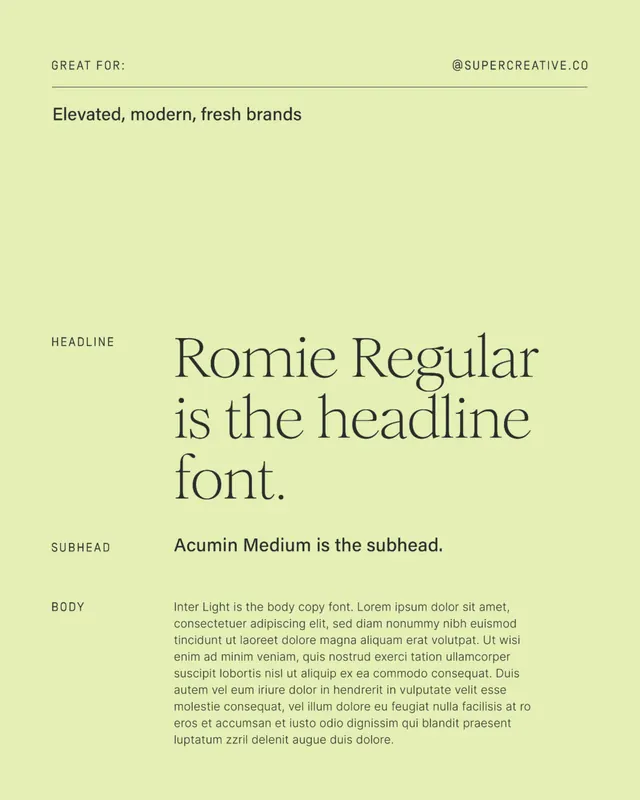
A type specimen layout showcasing Romie Regular serif headline font, Acumin Medium subhead, and Inter Light body copy against a pale lime background.
Summary
A type specimen layout showcasing Romie Regular serif headline font, Acumin Medium subhead, and Inter Light body copy against a pale lime background.
Visual description
A pale yellow-green background anchors a clean, left-aligned type specimen. At the top, a horizontal line separates "GREAT FOR: Elevated, modern, fresh brands" (left) from "@SUPERCREATIVE.CO" (right). Below, a large centered block of Romie Regular italic serif text reads "is the headline font" with the word "Headline" labeled to its left. Beneath that, three labeled sections present the typeface system: "Headline" (Romie Regular in large serif), "Subhead" (Acumin Medium in medium-weight sans-serif), and "Body" (Inter Light in regular sans-serif running as Lorem ipsum placeholder text). The layout uses a clear grid and generous margins, with text labels in a condensed all-caps sans-serif.
Key takeaway
The restrained color palette (pale lime, olive undertones, charcoal text) creates sophistication without visual noise. The three-tier typographic system is clearly presented and easy to reference. Left-aligned labels paired with centered content creates visual hierarchy while maintaining alignment discipline.
Reuse notes
Effective for any brand type specimen or font pairing guide, especially when targeting design-forward audiences. The serif-plus-sans-serif combo works for elevated, editorial, or premium brands. Scale well for print or digital applications.
More like this

Keep what you find
A free account saves references to boards and can send you a weekly email of picks based on what you save.
To see every result, go Pro.