Preview image. Unlock full-res
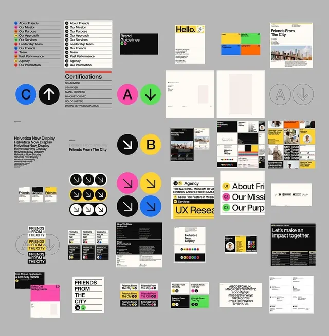
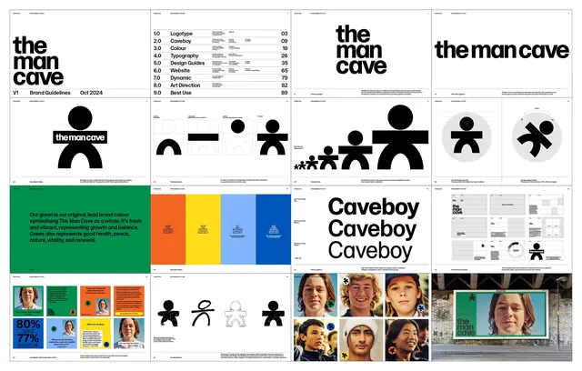
A minimalist brand identity for TheMancave using bold stick-figure icons in black, paired with a vibrant 4-color palette (orange, yellow, blue, green) and applied across brand guidelines.
Summary
A minimalist brand identity for TheMancave using bold stick-figure icons in black, paired with a vibrant 4-color palette (orange, yellow, blue, green) and applied across brand guidelines.
Visual description
The brand system showcases a core stick-figure icon family in black: a round-headed man with arms and legs, variations for "The Man Cave" and "Caveboy", progressively smaller scales, outline vs. filled versions, and lifestyle combinations (families, groups). The primary logo sits within a rounded rectangular badge. A secondary color bar displays four bold color blocks: bright orange, golden yellow, royal blue, and forest green. The guide includes typography specifications, logo variations, application samples on colored backgrounds, photography direction (diverse male faces and lifestyle imagery), and implementation guidelines in a organized grid layout. The color palette, while vibrant, is shown against neutral backgrounds to demonstrate versatility. Heavy sans-serif typography reinforces a contemporary, approachable brand voice.
Key takeaway
The stick-figure icon as a scalable, memorable core device: simple enough to work at any size, flexible for variations (solo, family, community), and distinctly recognizable. The 4-color palette strikes a balance between personality and professionalism. The structured layout of the brand guide makes specifications clear and implementable.
Reuse notes
Best for lifestyle, apparel, or community-focused brands targeting a masculine or casual audience. The color palette is punchy for bold digital applications but scales well to print. The icon system's simplicity means it can be animated or reinterpreted across media. Photography integration shown here is lifestyle-first, adding warmth to the geometric brand elements.