Preview image. Unlock full-res
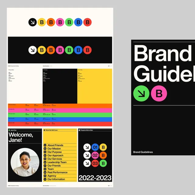
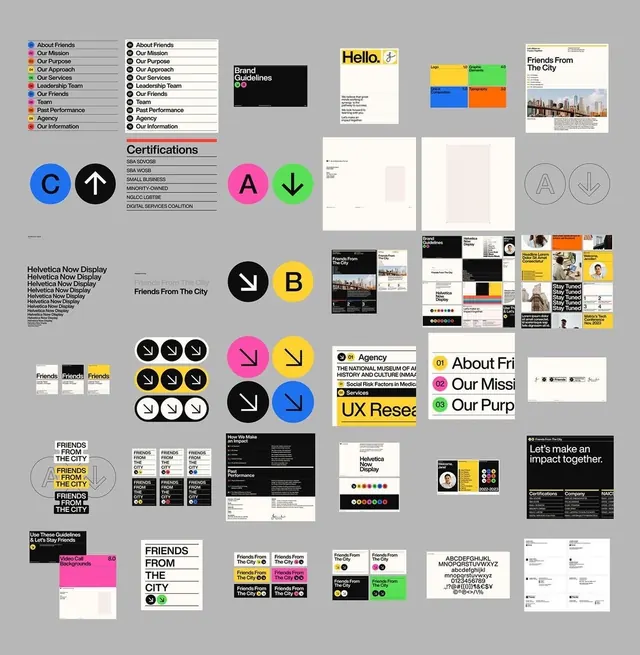
Complete brand identity system for Friends From The City featuring an organizational chart, modular icon set with circular directional motifs, supporting collateral designs, and comprehensive application examples across print and digital touchpoints.
Summary
A comprehensive organizational brand system for Friends From The City presenting modular components including icon library, circular directional marks, organizational structure chart, and applied design across business documents, posters, and digital media mockups.
Visual description
A grid-based collage showcasing a complete design system on a light gray field. Left side features an organizational chart listing functions (About Friends, Our Mission, Our Purpose, Our Approach, Our Story, Leadership Team) in columnar format, paired with a row of eight colored circles labeled A through G in bright blue, pink, yellow, black, and white forming a certification or status marker system. Center and right areas display applied examples: branded documents and letterhead templates, circular arrow icons in various rotations (white outlines on black circles), logo variations in pink and yellow, typography guidelines, and a poster series for "Friends From The City" using bold yellow backgrounds and black sans-serif type. Additional mockups show email templates, web layouts, and publication spreads. The overall palette is monochromatic (black, white, gray) with strategic bright accents (magenta, yellow, lime green, electric blue) used as system-wide accent colors.
Key takeaway
A modular icon system built from simple circular forms and directional arrows that conveys both structure and energy. The approach of presenting a complete brand system as a dense specimen wall showing every component in context (guidelines, icons, applications, collateral) at once. The systematic use of a small accent-color palette applied consistently across diverse formats to unify disparate layouts.
Reuse notes
Reference for designing comprehensive brand systems for agencies, nonprofits, or organizations with multiple internal teams. The grid-based collage layout works well for presenting system scope without a separate brand-book PDF. The directional-icon motif is reusable across signage, digital interfaces, and print. The bright accent strategy brings visual cohesion to layouts that would otherwise feel disparate. Best suited to contemporary or creative organizations; the brutalist structure and high-contrast palette read as modern and forward-thinking.