Preview image. Unlock full-res
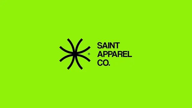
A geometric logo mark in black set against luminous lime green, pairing a six-pointed star motif with stacked wordmark in all-caps sans-serif.
Summary
A geometric logo mark in black set against luminous lime green, pairing a six-pointed star motif with stacked wordmark in all-caps sans-serif.
Visual description
A centered, symmetrical composition on a full lime-green background. At left, a six-pointed star rendered as clean black curved strokes radiating from a central point, creating a compass or flower-like silhouette. At right, the brand name "SAINT APPAREL CO." is stacked vertically in bold, all-caps sans-serif (wider than usual, condensed stroke weight) in black. A small registered-mark symbol sits between the mark and wordmark. The geometry is sharp and precise, the spacing balanced.
Key takeaway
The use of a single, bold geometric symbol paired with stacked wordmark creates instant recognition and scales from tiny mark to full signage. The lime-green complement on black provides maximum contrast and pop, especially for apparel and retail. The all-caps treatment is confident and modern.
Reuse notes
Strong for athletic, streetwear, or youth-focused brands needing immediate visual impact. The geometric mark works at any scale. The lime-green is striking but limit to brands that can sustain it across product lines. Works best on dark or light solid backgrounds.