Preview image. Unlock full-res
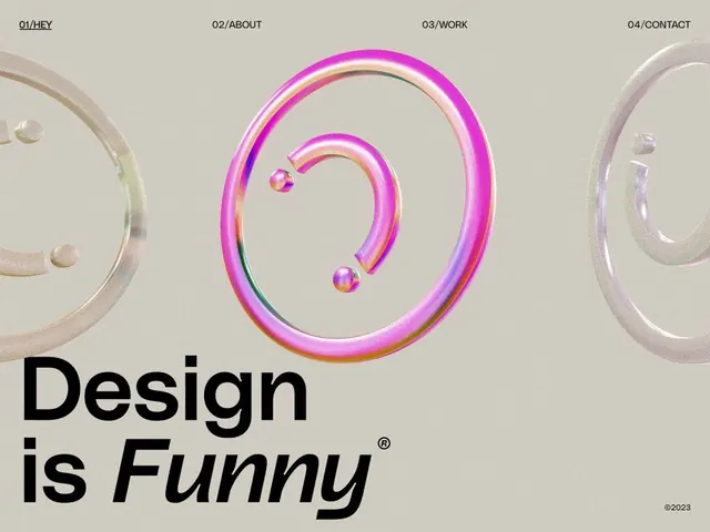
Creative agency brandmark combining soft beige grounds with overlapping gradient-ring forms (magenta to yellow) and bold black sans-serif logotype.
Summary
Creative agency branding system pairing soft beige and neutral tones with vibrant magenta-to-gold gradient rings and bold black-and-italic logotype, anchored by numbered navigation sections.
Visual description
A minimal brand system layout with a warm beige background. At top, four numbered sections (01/HEY, 02/ABOUT, 03/WORK, 04/CONTACT) in tight sans-serif caps are centered. The center features overlapping 3D-effect geometric rings with a pink-to-magenta-to-gold gradient applied to their outlines; the rings appear semi-transparent or with directional shading. Small gradient spheres float within or near the ring composition. Below, a large black sans-serif headline in regular and italic weight reads "Design is Funny" with a registered trademark symbol. A copyright date (2023) appears at bottom right. Neutral geometric forms (lighter beige/cream rings) appear at the left and right margins, creating a frame or bookend effect.
Key takeaway
Gradient-ring forms become sophisticated rather than saccharine when paired with stark beige and deep neutrals. The three-dimensionality (via shading and nested rings) signals craft and technical skill. Using the gradient on the outline rather than as a fill keeps it readable and elegant. The logotype's playful italics paired with bold weight creates personality without chaos.
Reuse notes
Ideal for creative agencies, design studios, and motion-focused brands wanting to signal both playfulness and sophistication. The gradient can be adapted to brand color ranges; the ring motif is flexible (nest them differently, rotate, or scale). Works best at large scales; avoid reducing below 400px width. The numbered navigation sections are easily swapped for actual site sections or project categories.