Preview image. Unlock full-res
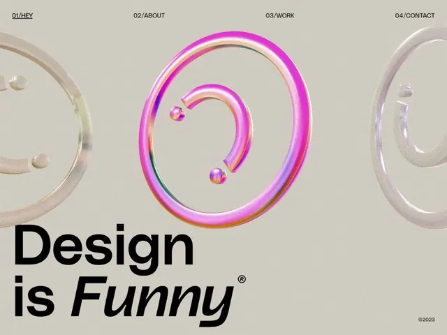
A stacked lowercase wordmark for 'first, affiliate' under a tilted hot-pink ellipse whose black outline is sliced and offset into two halves.
Summary
A logo lockup for "first, affiliate": a tilted hot-pink ellipse capped by a thick black outline that is cut through the middle and shifted, so the two outline halves slide past each other above a stacked lowercase wordmark.
Visual description
On a light grey ground, an ellipse leans at a slight angle. Its fill is saturated magenta-pink; its heavy black stroke is broken into a left and a right arc that are offset vertically, giving the ring a sliced, mid-rotation look as if the outline and fill have come apart. Below sits the name in a clean black lowercase sans-serif set on two lines, "first," over "affiliate," tightly stacked and left-anchored, with a notably elegant comma and the descender of the apostrophe matching the mark's weight. The palette is strictly three values: grey field, black type, pink accent. No tagline or supporting graphics.
Key takeaway
Slicing a simple geometric outline and offsetting the halves turns a plain ellipse into a dynamic, almost kinetic mark while keeping it reproducible in one or two colors. The hot-pink fill against an all-black outline and wordmark is a cheap, high-impact contrast move. Stacking the two words tight gives the lockup a solid type block to balance the loose ring.
Reuse notes
Good for a marketing, affiliate, or digital-services brand that wants to feel modern and a little irreverent without losing legibility. The offset-outline trick is the whole identity, so keep the surrounding layout calm. Single-color or embossed applications lose the pink-vs-black punch, so plan a mono fallback.