Preview image. Unlock full-res
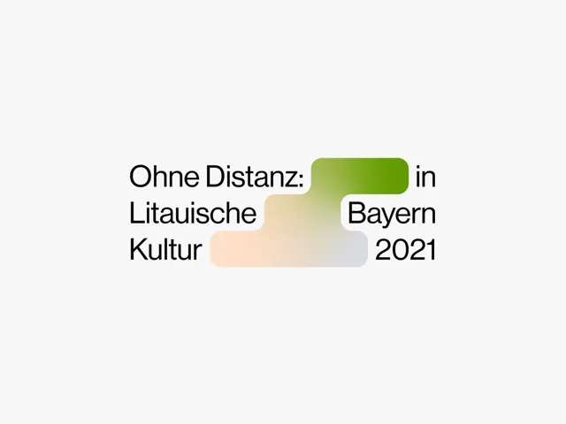
A bilingual typographic headline in heavy sans-serif with text wrapped around two soft-edged gradient bars, one pale peach-tan and one pale green, creating depth through color blocking.
Summary
A centered typographic layout in heavy sans-serif with German and English text interwoven, using two soft-edge gradient bars (peach and pale green) as color underlays to create visual depth and hierarchy.
Visual description
Black sans-serif text in a heavy weight is arranged in a centered, multi-line layout. Two rounded-corner bars with soft, feathered edges sit behind portions of the text. The top bar is a gradient from pale lime green at the left to near-white on the right; the bottom bar shifts from pale peach-tan on the left to pale gray-green on the right. The text wraps around these bars, with some letters sitting on the color, others on the off-white ground. The overall effect is spacious and calm, with generous negative space around the composition.
Key takeaway
Soft-edge gradient bars as a sophisticated alternative to solid color blocks. The restrained, warm pastel palette creating visual interest without noise. Text wrapping around organic shapes rather than sitting in fixed boxes.
Reuse notes
Well-suited for cultural event promotion, editorial headers, or minimalist institutional branding. The two interlocking gradients suggest movement and connection without being busy. Works at any scale but needs legible display type to succeed.
More like this


Keep what you find
A free account saves references to boards and can send you a weekly email of picks based on what you save.
To see every result, go Pro.