Preview image. Unlock full-res
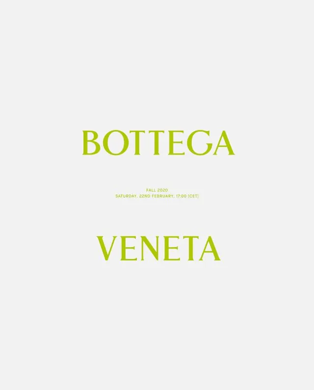
Two stacked sans-serif wordmarks in oversized yellow-green caps separated by subtle event meta, anchored in pale beige void.
Summary
Two oversized sans-serif wordmarks in golden-yellow caps stacked vertically, with minimal event meta (date, time, venue) in small caps between them, all floating in generous pale beige.
Visual description
The composition is centered and deeply symmetrical. "BOTTEGA" sits in the upper half in all caps, sans-serif, rendered in a warm yellow-green. Below it, small text specifies "FALL 2020 / SATURDAY, 22ND FEBRUARY, 17:00 (CET)" in a lighter weight and reduced size, acting as a delimiter. "VENETA" appears below in matching all-caps sans-serif, identical in color and scale to the first word. The background is a uniform, pale off-white or light beige with no texture or pattern. All text is centered; nothing else occupies the frame.
Key takeaway
The restraint: using two words and one date line, with no other visual noise, to convey luxury. The specific hierarchy (large wordmark, tiny meta, large wordmark again) creates anticipation. The off-white background acts as breathing room, making the typography feel like sculpture. The all-caps treatment and sans-serif choice read as contemporary and refined without being trendy.
Reuse notes
Perfect for high-end fashion events, gallery openings, or exclusive product launches where the brand name and date alone are sufficient. The pale palette works best for print (invitations, announcements). The vertical stacking is ideal for square or portrait formats. Avoid backgrounds with texture or pattern; this design needs void to succeed.
More like this

Keep what you find
A free account saves references to boards and can send you a weekly email of picks based on what you save.
To see every result, go Pro.