Preview image. Unlock full-res
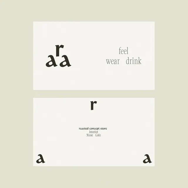
Type specimen showing five single letters ('a', 'd', 'r') in varying sizes and weights, set in soft off-white and warm gray on a cream background.
Summary
Type specimen showing five single letters in varying sizes and weights, set in soft off-white and warm gray on a cream background, demonstrating modular letterform hierarchy.
Visual description
Two rectangular blocks with a soft dividing line. Top block contains the letters 'a' and 'd' in black with serif-like terminals, positioned in the upper left and right margins, plus a gray label "feel / wear / drink" in tiny justified type. Bottom block presents the letter 'r' centered in large black type, flanked by a smaller 'a' on each side in gray, with small justified body text below. The entire composition is set against a warm cream background. The typeface is geometric with subtle dimensional details suggesting slight serifs or notches on key strokes.
Key takeaway
The use of relative sizing to show weight variation without names or numbers. The warm neutral palette (cream, warm gray, soft black) conveys luxury without aggressive contrast. The justified small-cap labeling suggests premium packaging or editorial design systems.
Reuse notes
Pull this for luxury, packaging, or editorial brands where type speaks louder than imagery. The cream background is essential to the warmth; white would flatten the effect. Works best when the typeface itself is geometric with subtle details.
More like this



Keep what you find
A free account saves references to boards and can send you a weekly email of picks based on what you save.
To see every result, go Pro.