Preview image. Unlock full-res
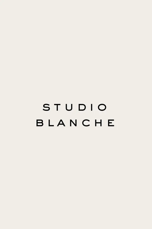
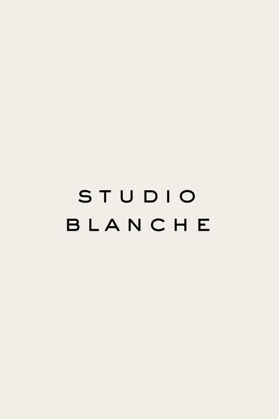
Two-line sans-serif wordmark centered on beige, Studio Blanche demonstrates refined typographic restraint through letterform weight and geometric spacing.
Summary
Two-line sans-serif wordmark centered on beige, Studio Blanche demonstrates refined typographic restraint through letterform weight and geometric spacing.
Visual description
A centered layout on warm beige background displaying "STUDIO" above "BLANCHE" in a geometric sans-serif with consistent, generous tracking. Each character is equally weighted and spaced, the composition symmetrical and balanced. The letterforms are neutral, open, and unharnessed by decoration. Negative space is central to the composition, surrounding the text above and below.
Key takeaway
The power of pure spacing and letter weight to convey luxury; geometric sans-serif at display scale with ample breathing room; how restraint can feel more premium than ornament.
Reuse notes
Use for minimalist branding, type-forward identities, editorial design. Works well in luxury, studio, and contemporary contexts where understatement signals sophistication.
More like this


Keep what you find
A free account saves references to boards and can send you a weekly email of picks based on what you save.
To see every result, go Pro.