Preview image. Unlock full-res
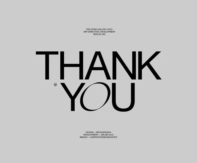
Minimal type specimen for Per-Sona Gallery (Berlin) in 2020 using oversized sans-serif and pure negative space to create a sophisticated thank-you statement.
Summary
A gallery thank-you card typography specimen set in oversized black sans-serif on light gray, attributed to Per-Sona Gallery in Berlin and designed by Rhom Berisha and Arund Aliu.
Visual description
A light gray rectangle with centered typography. At top, small caps read "PER-SONA GALLERY 2020 / ART DIRECTION, DEVELOPMENT / BERLIN (DE)". The phrase "THANK YOU" occupies the middle third in large, bold, black sans-serif letters (approximately 48 pt or larger), with an asterisk accent between the words. At bottom, smaller caps credit the designers: "DESIGN = RHOM BERISHA / DEVELOPMENT = ARUND ALIU / IMAGES = CARPENTERSGMORPHOSIS". Ample white space surrounds the typography. The typeface is clean, geometric, and contemporary.
Key takeaway
The restraint of centering a single statement in oversized type with nothing else competing for attention. The asterisk as a subtle flourish that adds interest without clutter. The use of all-caps in a modern sans-serif to convey institutional authority while maintaining warmth through scale and spacing.
Reuse notes
Ideal for gallery thank-yous, institutional correspondence, or print collateral for minimalist brands. Works best when printed at scale to let the typography breathe. The small-caps hierarchy (header, main text, footer) is elegant without overcomplicating. Ensure photography or color never overpower the type-first principle here.
More like this





Keep what you find
A free account saves references to boards and can send you a weekly email of picks based on what you save.
To see every result, go Pro.