Preview image. Unlock full-res
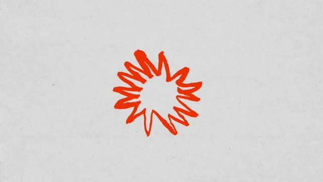
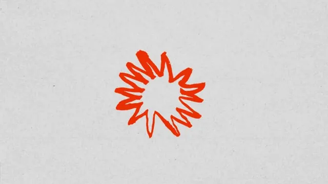
A simple orange starburst or radial burst logo mark with jagged rays, centered on a light gray background, suggesting energy, alert, or dynamic movement.
Summary
A single abstract logo mark in warm orange composed of roughly twelve jagged rays radiating from a circular empty center, evoking urgency, illumination, or dynamic energy.
Visual description
A centered mark on a neutral light gray background. The logo is a single solid orange (hex approximately #E07E68, a warm terracotta-orange) circle with triangular rays extending outward at irregular angles. The rays vary slightly in length and are not perfectly symmetrical, giving the mark a hand-drawn, organic quality despite its geometric intent. No additional graphical elements, text, or color variations. The empty white space at the center creates a hollow, energetic quality. The overall composition balances simplicity with visual dynamism through the jagged rhythm of the rays.
Key takeaway
The restraint of using only two colors (orange and negative space) to convey motion and urgency. The slight irregularity of the rays prevents the mark from feeling mechanical while keeping it instantly recognizable. A minimal mark like this scales from icon size to large-format signage without loss of clarity.
Reuse notes
Strong fit for tech, marketing, or notification-heavy applications where urgency or attention-grabbing is the goal. The warm orange is approachable and energetic without feeling corporate. Works well as a favicon, app icon, or accent mark in a larger system. Pair with neutral backgrounds or typography-heavy designs to let the mark breathe. Less suitable for luxury or minimalist brands where restraint is paramount.