Preview image. Unlock full-res
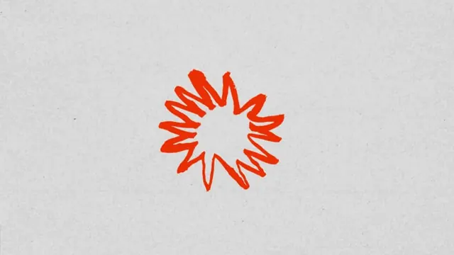
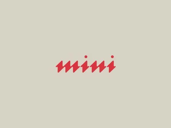
Minimalist wordmark composed of six coral zigzag strokes with two accent dots, reading as both lightning and the word mini in compressed geometric form.
Summary
Minimalist two-color mark reducing the word "mini" to six interlocking zigzag strokes in coral-red with two small dot accents, set on a light beige field.
Visual description
Centered on a neutral light beige background, a logo composed of six coral-red lightning-bolt or zigzag shapes arranged horizontally in a tight rhythm, suggesting both the letters of the word "mini" and a burst of energy or motion. Two small crimson dots sit above the letterforms as accent marks, possibly representing the letter "i" dots. All strokes are sharp, clean, and geometric with no curves. The mark is compact and horizontally oriented, reading as a complete word unit rather than an abstract symbol alone.
Key takeaway
The visual pun of reducing a word to its most essential geometric skeleton while maintaining readability and suggesting motion. The use of two small dots as both a design element and a type convention (the i-dot) adds a layer of intentionality. The minimal color palette keeps attention on form rather than decoration.
Reuse notes
Strong for a tech, app, or startup brand seeking energy without complexity. The compact horizontal form suits app icons, favicon placement, and small-scale application well. Works best on light backgrounds; reverse (white on dark) would lose the subtle warmth. Avoid if you need softer, more organic letterform treatments.