Preview image. Unlock full-res
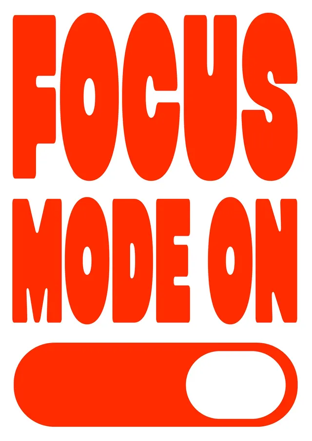
Stacked two-line sans-serif wordmark 'FOCUS MODE' in bright orange with a white toggle switch element below, rendered as a minimal call-to-action logo.
Summary
A two-line all-caps wordmark with a geometric toggle-switch control beneath, communicating a dual on/off state through typography and functional UI metaphor.
Visual description
Bright orange (#FF2C00) sans-serif capitals arranged in two lines: FOCUS on top in a condensed, rounded typeface with generous letter spacing and organic curves (particularly the O and S), MODE on the bottom in matching style. Below sits a white rounded-rectangle toggle switch with a pill-shaped active zone on the right side, rendered as a filled shape that echoes the organic forms of the lettering. The composition is vertically centered on a pure white background. The tight letter-spacing and generous curves give the type a friendly, approachable energy despite the bold orange.
Key takeaway
The integration of functional UI elements (the toggle) into a wordmark creates a dual message: a name plus a metaphor for activation. The rounded, organic curves in the sans-serif letterforms soften the high-contrast orange-on-white palette, making urgent copy feel inviting rather than aggressive. The toggle visually reinforces the brand promise (turning focus on/off) without needing explanation.
Reuse notes
Ideal for productivity apps, focus-timer software, or habit-tracking tools where the concept of toggling or activating is central to the product. The orange hue reads as energetic and attention-commanding; pair with white space to let it breathe. The organic curved typeface softens minimalist aesthetics, making it work for both professional and playful contexts. The toggle metaphor is instantly readable across cultures.