Preview image. Unlock full-res
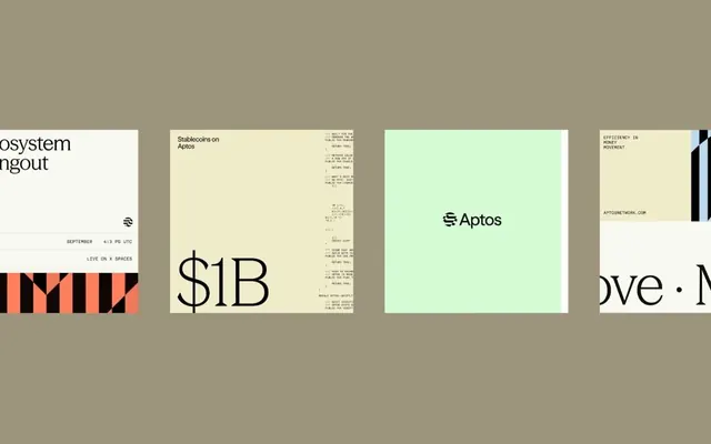
Blockchain brand identity for Aptos spanning four application types: event promotion, financial metrics display, product mark, and documentation, unified by taupe palette and geometric mark.
Summary
Aptos blockchain brand system showing four application contexts on taupe ground: event communications, financial reporting, product mark refinement, and technical documentation, all unified by geometric mark and restrained earth/mint palette.
Visual description
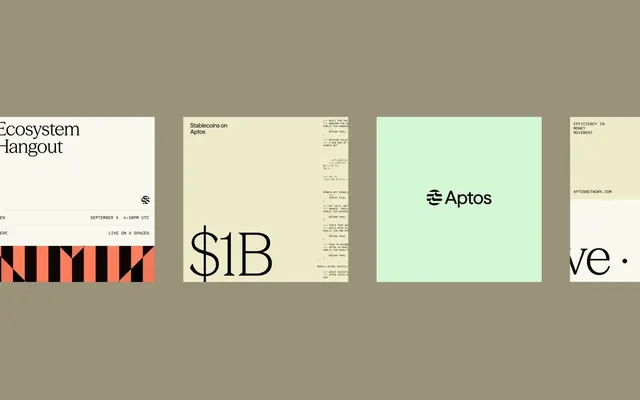
Four distinct identity applications arranged horizontally across a warm taupe background. Left panel shows partial event branding with coral-and-black striped accent and text details. Second panel features a large "$1B" display type in serif outline, with dense technical fine-print stacked above and below (metrics, timestamps, cryptocurrency details). Third panel showcases the core Aptos mark (a geometric chevron or two-line symbol) centered on a soft mint-green field, reading "Aptos" in sans-serif below. Rightmost panel displays technical documentation with geometric line-work mark, website URL, and efficiency statements. Typography throughout is clean sans-serif, ranging from display sizes for emphasis to small technical copy. The color story spans taupe, cream, mint-green, and accent coral, creating a sophisticated fintech aesthetic that bridges corporate minimalism with blockchain accessibility.
Key takeaway
The discipline of showing one mark system across four distinct professional contexts, the pairing of warm taupe with cool mint as a memorable brand palette, the use of geometric marks that work equally well at small scale (favicon) and large scale (mark focus), and the balance between professional sans-serif display type and dense technical typography for credibility.
Reuse notes
Strong reference for fintech and blockchain brands seeking legitimacy without coldness. The earth-tone and mint pairing feels both premium and accessible. Works when the brand needs to serve both investor/analyst audiences (financial metrics, transparency) and end-user developer communities (technical docs). Mark design is modular and scales well. Best for b2b-facing financial or infrastructure projects.
More like this



Keep what you find
A free account saves references to boards and can send you a weekly email of picks based on what you save.
To see every result, go Pro.