Preview image. Unlock full-res
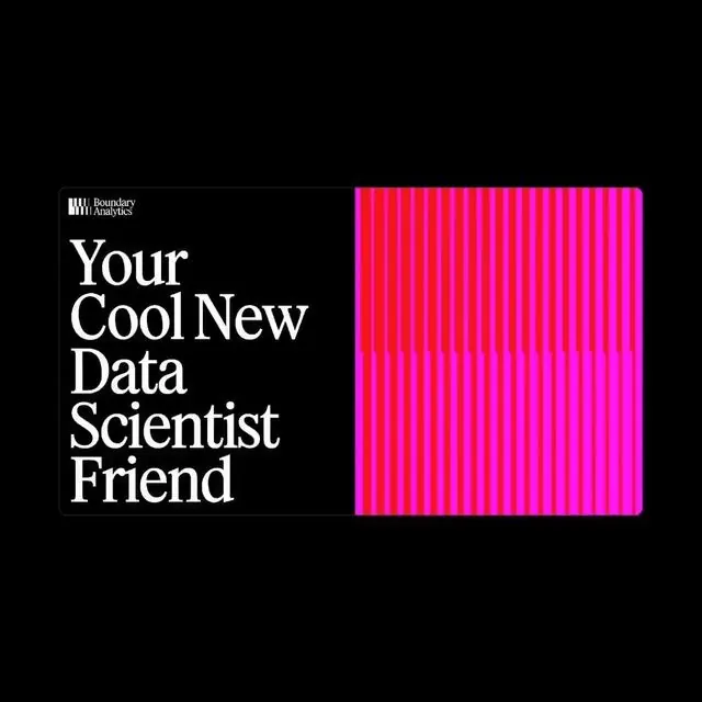
A stark brutalist logo pairing a black left panel with white serif typography and a vibrant neon magenta right panel filled with vertical line patterns, evoking technical precision and data-driven energy.
Summary
A brutalist split-screen logo dividing identity into pure content and pure pattern: black left side carries serif wordmark and company tag, neon magenta right side vibrates with dense vertical lines suggesting data flow and digital intensity.
Visual description
The composition is an exact vertical bisection. The left half is pure black with white serif typography: the word "Your" / "Cool New" / "Data Scientist" / "Friend" stacked left-aligned with "Boundary Analytics" as a small tag above, rendered in a clean serif or transitional typeface with generous letter spacing. The right half is completely filled with a dense pattern of evenly-spaced vertical neon magenta lines on a darker magenta ground, creating a rhythmic, moiré-like texture that suggests data streams or digital oscillation. The neon magenta is intense and fluorescent, a contemporary color choice that reads energetic rather than playful. The line weight of both typography and pattern strokes is consistent and deliberate. The overall effect is austere and almost aggressive in its geometric purity.
Key takeaway
The split-screen as an identity system: data science and analytics need visual vocabularies that suggest both rigor and contemporary tech culture; here the left-right division metaphorically separates the human-readable message from the computational substrate. The vertical line pattern as a standalone visual system that can scale, tile, and accent. The serif font choice grounding an otherwise futuristic design in editorial and institutional authority.
Reuse notes
Works well for data-science, analytics, or research-forward education brands that need to signal both accessibility and expertise. The neon magenta is bold and memorable but limits context; avoid using it on saturated backgrounds or in print applications where the glow effect is lost. The symmetrical split scales to business cards, social avatars, and pattern systems.