Preview image. Unlock full-res
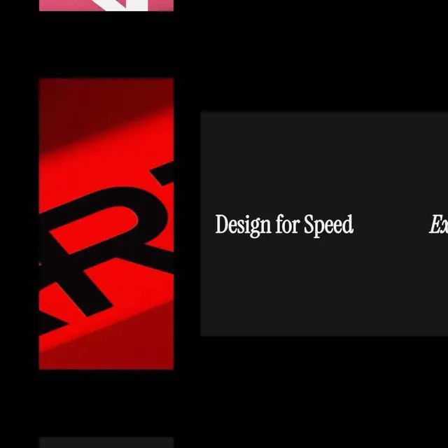
Split composition blending a bold red geometric mark with black negative space and serif display type on a minimalist dark ground.
Summary
Split composition blending a bold red geometric mark with black negative space and serif display type on a minimalist dark ground.
Visual description
A vertical red abstract form fills the left third of the frame, composed of interlocking geometric planes that suggest a stylized letterform or glyph. Thick black outlines and negative space carve the shape, creating sharp angles and curved cutouts that read as dynamic and forward-moving. The right side sits on a charcoal background with the serif headline "Design for Speed" in white and a partial word visible at the edge, balanced below by supporting copy. The overall composition is asymmetrical, anchored by the red mass on the left with white typography on the right providing breathing room.
Key takeaway
The use of bold figure-ground reversal with tight black outlines to define a complex mark. The serif-heavy headline treatment contrasting against geometric abstraction. Pairing one loud color mass (red) with pure black and white to maximize impact on a dark field.
Reuse notes
Strong for tech, design, or creative services brands wanting to convey speed and precision. Works best when the left-side mark can anchor the identity across applications (card, website, environmental). The serif typeface signals established craft; the red geometric form signals innovation. Avoid on light backgrounds without reworking the contrast ratios.