Preview image. Unlock full-res
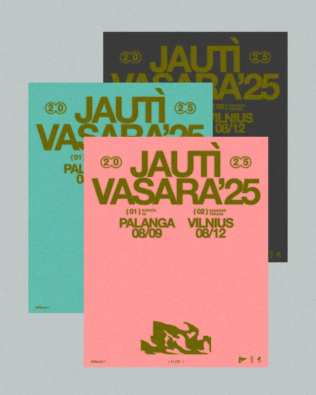
Overlapping stacked posters for Jauti Vasara'25 festival, each in a distinct color (teal, coral, charcoal), announcing dates and venues in bold, chunky serif display type.
Summary
Festival poster composition for Jauti Vasara'25 (a Baltic summer festival) rendered as three overlapping posters in teal, coral, and charcoal, each announcing separate venue dates in all-caps bold serif type.
Visual description
Three rectangular posters arranged in an overlapping stack, each a distinct solid color: teal, coral pink, and dark charcoal. All three repeat the same bold all-caps serif headline "JAUTI VASARA'25" in a darker or complementary tone (muted olive-brown) with circular numbered badges (20, 23) flanking the type. Each poster lists venue and dates: "PALANGA 08/09" (teal) and "VILNIUS 08/12" (coral); the charcoal poster repeats similar information. A small geometric distressed icon appears bottom-center (coral poster). The layout is deliberately chaotic, suggesting energy and urgency through color contrast and overlapping planes rather than alignment.
Key takeaway
The power of high-saturation color blocking to create visual impact without imagery. The repetition of type at different scales and on different color grounds tests legibility and creates rhythm. The addition of numeric badges adds a small visual hook. Overlapping posters multiply the information density while keeping each poster individually readable.
Reuse notes
Ideal for event, festival, and cultural promotion. The high contrast (teal/coral/charcoal) works well for outdoor or social-media promotion. Works less well for luxury or minimal brands. The stacked-poster approach can obscure information if too many layers are added; keep to 2-3 overlaps. The serif display type should be bold enough to hold up in small reproduction.
More like this

Keep what you find
A free account saves references to boards and can send you a weekly email of picks based on what you save.
To see every result, go Pro.