Preview image. Unlock full-res
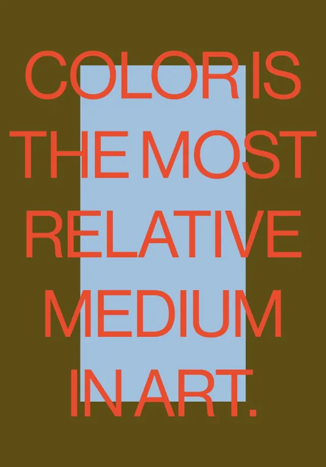
Stark typographic poster asserting a color theory principle in large red sans-serif type bisected by a cool blue rectangle against warm olive background.
Summary
A typographic poster stating a color theory maxim in bold red sans-serif type, bisected by a light blue rectangle against a muted olive-green background.
Visual description
Vertical composition with olive-khaki background. Large red sans-serif type declaring "COLOR IS THE MOST RELATIVE MEDIUM IN ART" is split by a pale blue-gray rectangular cutout that runs vertically through the center of the composition, obscuring portions of several letters. The text is centered and tightly tracked, with uniform stroke weight emphasizing the geometric quality of the type. The two-tone color interaction (warm olive against cool blue, plus the vibrant red type) creates a composition about color relationships that visually demonstrates the statement.
Key takeaway
Using text itself as the vehicle for demonstrating a design principle: the composition is literally about color relativity. The pale blue rectangle creates a visual "window" that forces the eye to see the red type in two different contexts simultaneously, proving the point. The restraint of three colors and one text element; no embellishment.
Reuse notes
Effective for educational or theoretical design posters, manifestos, or art direction that needs to teach and persuade simultaneously. The austere palette and geometric split give it gallery/museum credibility. Works well in small or large formats; the simple geometry scales without loss. Pair with similar theoretical typography or minimal color-field work.
More like this


Keep what you find
A free account saves references to boards and can send you a weekly email of picks based on what you save.
To see every result, go Pro.